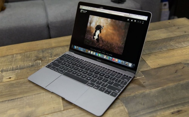
Everything about the new MacBook screams “future,” but can it handle today?
That was the basic question I asked myself when reviewing Apple’s latest Mac, which bravely sports just one USB-C port to handle power, data input and output, accessories and display connections. It also has an Intel Core M processor, which lets the MacBook sip power and drop fans entirely, but comes at the cost of processing muscle. Apple took some risks, for sure, but the MacBook might just be my favorite portable Mac ever.
Basics
- 12-inch, 2304×1440 display, 226 PPI
- 1.1GHz Intel Core M dual-core processor with Turbo Boost to 2.4GHz
- Intel HD Graphics 5300
- 8GB of RAM
- 256GB PCIe-based flash storage
- 480p FaceTime camera
- 802.11ac Wi-Fi, Bluetooth 4.0
- Single USB-C port for data I/O, display, networking and power
- 3.5mm stereo audio in/out port
- Force Touch trackpad
- 39.7-watt-hour battery offers 9 hours web browsing, 10 hours offline iTunes movie playback
- MSRP: $1,299 (as tested)
- On sale Friday, April 10 starting at 12 AM PT/3 AM ET
- Product info page
Pros
- Amazingly portable
- Gorgeous display
Cons
- Single port
Design
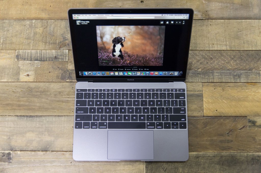
Without question, this is the best notebook available in terms of pure design appeal. That sleek aluminum shell, with its all-metal hinge and three distinct color options, is simply the best looking portable computer currently on the market. No one who’s seen my tester has not instantly wanted one, based just on its outward appearance. My review unit is the space gray model, and the color alone makes all other older MacBooks seem bland by comparison.
I’d almost be happy to leave the design discussion there, if not for the stunning details you find when you examine every inch of this computer. The all-aluminum hinge, for instance, replaces the plastic one found on previous metal unibody Mac notebooks. That seems like a small change, but it truly elevates the design, making the MacBook seem even more like a computer magically hidden away inside a slab of perfectly machined metal.
This is the best notebook available in terms of pure design appeal.
The lack of external holes in the case also add to this effect. Say what you will about the functional validity of including just one USB-C and one 3.5mm audio port – it definitely increases the aesthetics of the outside case. It makes you yearn for the day when they can drop physical ports altogether, in fact.
Apple’s MacBook is remarkable, too, in just how much computer is packed into so little space. The case is only 13.1mm thin at its thickest point, and it weighs just 2 lbs. That’s only half a pound heavier than the original iPad, and under 3mm thicker (at the MacBook’s thickest point). When I first picked it up, I couldn’t shake the feeling that it actually had more in common physically with the iPad lineup than with Apple’s notebooks, a sentiment enhanced by the fact that it fit easily inside the tablet pocket in the backpack I primarily used to tote it around.
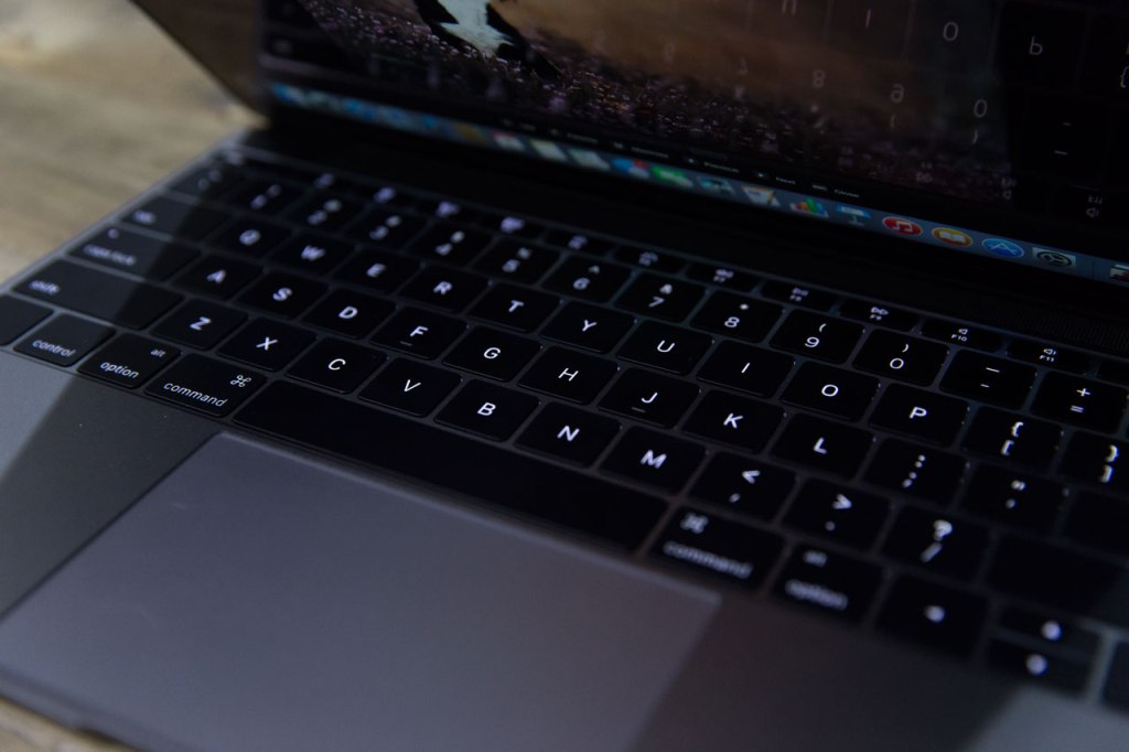
Other elements of the design that stand out include the keyboard backlights, which are now supplied by individual LEDs for each keycap, and which look much better than their predecessors. The smaller black bezel surrounding that 12-inch Retina display is also a big improvement in terms of overall charm, and the groove Apple uses to let you lift the lid when the clamshell is closed is surprising in that it doesn’t seem to make it any more difficult than previous models to open one-handed, which you’d probably expect from a lighter machine.
Features
Force Touch Trackpad
The MacBook’s new Force Touch trackpad is a prime example of all the brand new Apple tech that enables this notebook to exist in the form that it does. The trackpad has zero mechanical travel, but that doesn’t stop it from feeling like a button that you can actually click, thanks to the “taptic” feedback engine that Apple is using here to provide vibration response. The engine can create extremely localized responses, letting you feel that physical click sensation directly under your fingertip no matter where you press down.
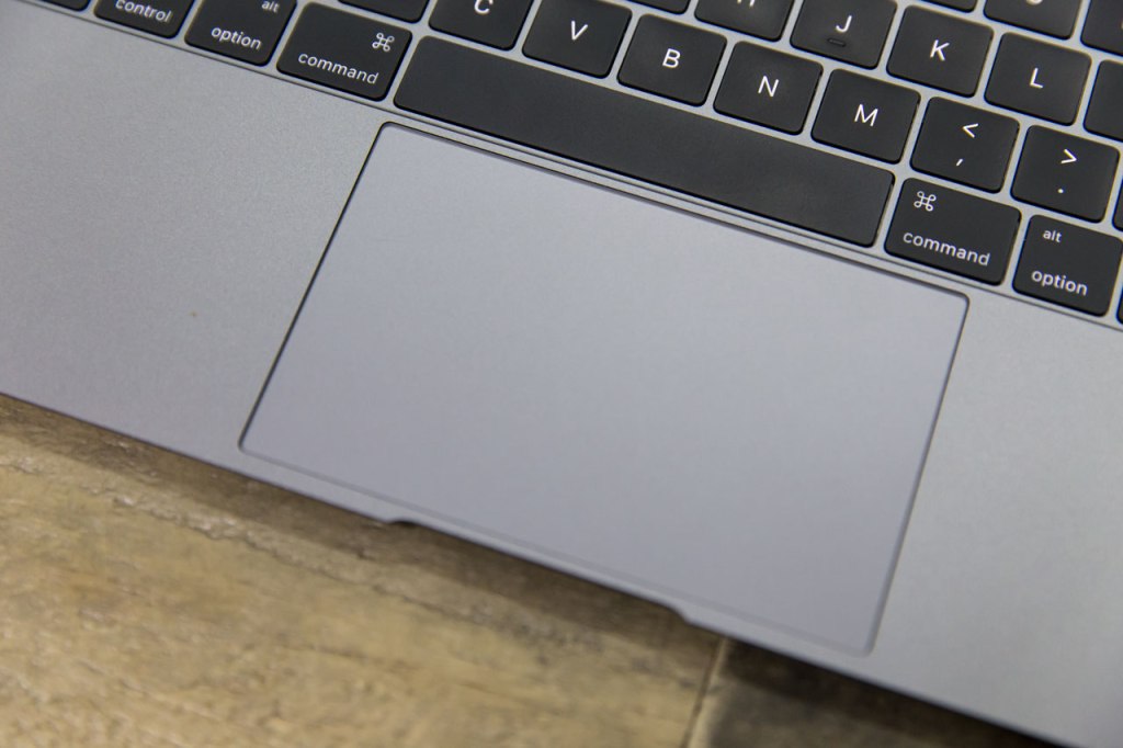
As I’ve discussed in my recent 13-inch MacBook Pro review, the tactile response isn’t exactly the same with Force Touch trackpads as it is with the old clicky kind – but after an initial adjustment period, that actually ends up being a benefit, since the ‘click’ you feel is the same across the trackpad, and produces consistent results (which wasn’t always true with the mechanical switch).
The trackpad also allows for ‘force touch’ interaction, which translates a secondary, ‘deeper’ click into various actions, like getting dictionary definitions or website previews in Safari. Plus, it’s a feature third-party developers can (and already are) using to add new dimensions of interactivity to their apps.
The MacBook’s new trackpad takes a very modest amount of getting used to, but pretty quickly you’ll forget entirely that it’s changed – and if you’re like me, you’ll also probably be using the dictionary to look up “Force Touch feature” more often than you might care to admit.
Keyboard

Apple had to redesign the MacBook’s keyboard, just like they did the trackpad, in order to make that incredibly shallow case. They did so by replacing the traditional scissor-based keyboard switches with a new butterfly mechanism, which saves 40 percent thickness per key. That means that you get less travel with each press, but Apple also points out that there’s greater stability across the key, meaning keys don’t ‘lean’ to whatever corner you’re exerting the most pressure on which each keystroke.
As with the Force Touch trackpad, the new keyboard takes some time to get accustomed to. The travel is quite a bit shallower than it has been even on MacBooks past. And while I’d say that the adjustment period required to get comfortable typing on the new MacBook’s keyboard is longer than the one required to get used to the new trackpad, I still found that it was very quickly a non-issue.
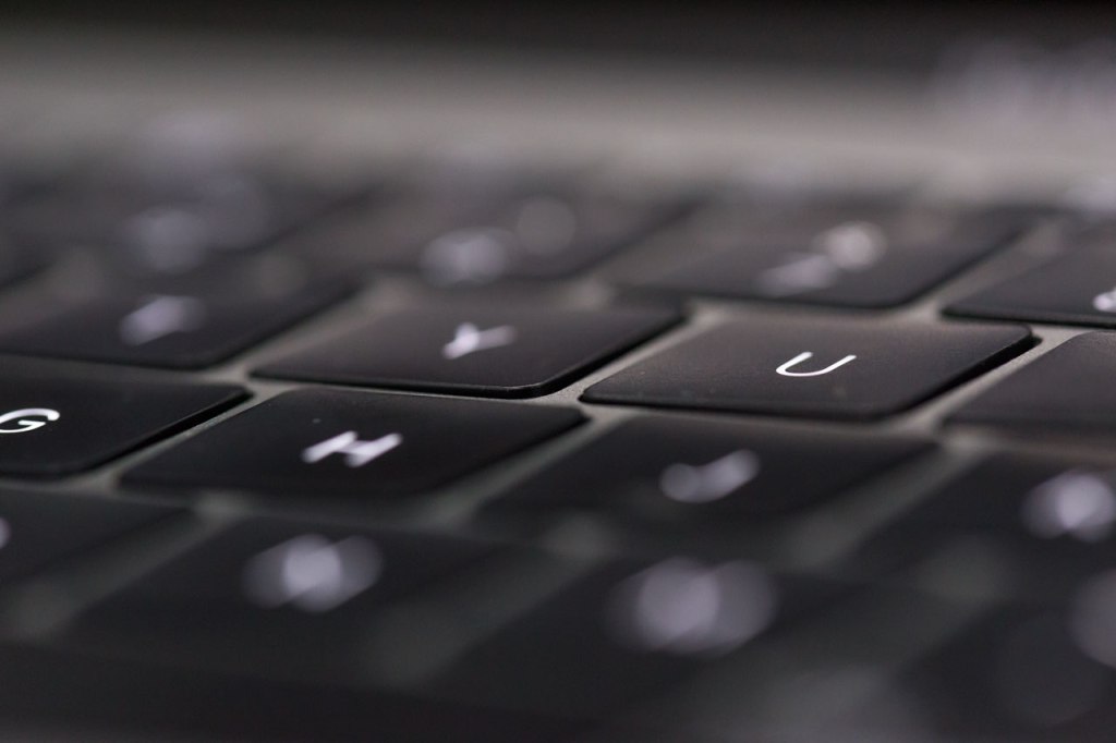
Apple has delivered a full-sized keyboard here, despite the size constraints in place thanks to the extremely small overall case design. While it’s hard to ascribe an exact benefit value to the new butterfly mechanisms and that more even key press, I’d wager that the new mechanisms have something to do with how quickly I became comfortable typing on the new MacBook.
This isn’t at all the same as having to get used to working with one of the myriad iPad keyboard cases – it’s just a matter of recognizing that you aren’t going to have to hammer away as you would with older Mac keyboards, and as a touch typist I now feel just as at home with the new MacBook as I have with any other Apple notebooks.
The key backlights are a big improvement, with their one LED per key design, offering just as much visibility in dark environments but with a much more pleasing overall look and light that seems more focused on you, the user, and therefore less likely to distract or catch the attention of onlookers.
Single USB-C Port
Despite brand new input hardware in the form of re-engineered keyboard and trackpad, the MacBook’s most dramatic change, at least from a user interaction standpoint, might actually be the use of just one data and power port. The single USB-C port on the MacBook’s left flank was a contentious topic at its debut, and was consequently something I paid close attention to during testing.
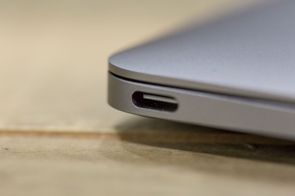
My surprising conclusion was that I actually hardly noticed having just one port at all. And that’s during standard notebook usage, which for me involves a fair amount of dedicated, continuous computer use while on the road.
The caveat here is that I always revert to using a desktop when at home, so if you’re looking for a single computer to rule them all and are used to plugging a lot of stuff in at the office or at home, the single port is going to be much more of an issue. Once we start to see more multipurpose hubs and docks it’ll be less onerous, but for now whether or not this is a second computer will be a big consideration, especially for power users.
Apple provided a USB-C to standard USB 3.0 adapter with the notebook, which retails for $19 from Apple’s online store, and this proved the only one I needed the few times I required plug-in accessories. I used it only a handful of times, when connecting my SD card reader to import video to Final Cut Pro, and when I plugged in my USB-to-XLR microphone adapter for recording video voice over and podcasts.
Charging and Power
Charging via the USB-C port is interesting, because it does indeed grip tightly, unlike MagSafe, meaning you’re definitely in danger of tripping on the cord and pulling your notebook off the desk and to the ground. This is clearly a calculated sacrifice on Apple’s part, and one that ultimately didn’t prove bothersome to me: I found that I treated this MacBook much more like an iOS device, using it unplugged during the day and plugging it in on the bedside table at night to replenish.
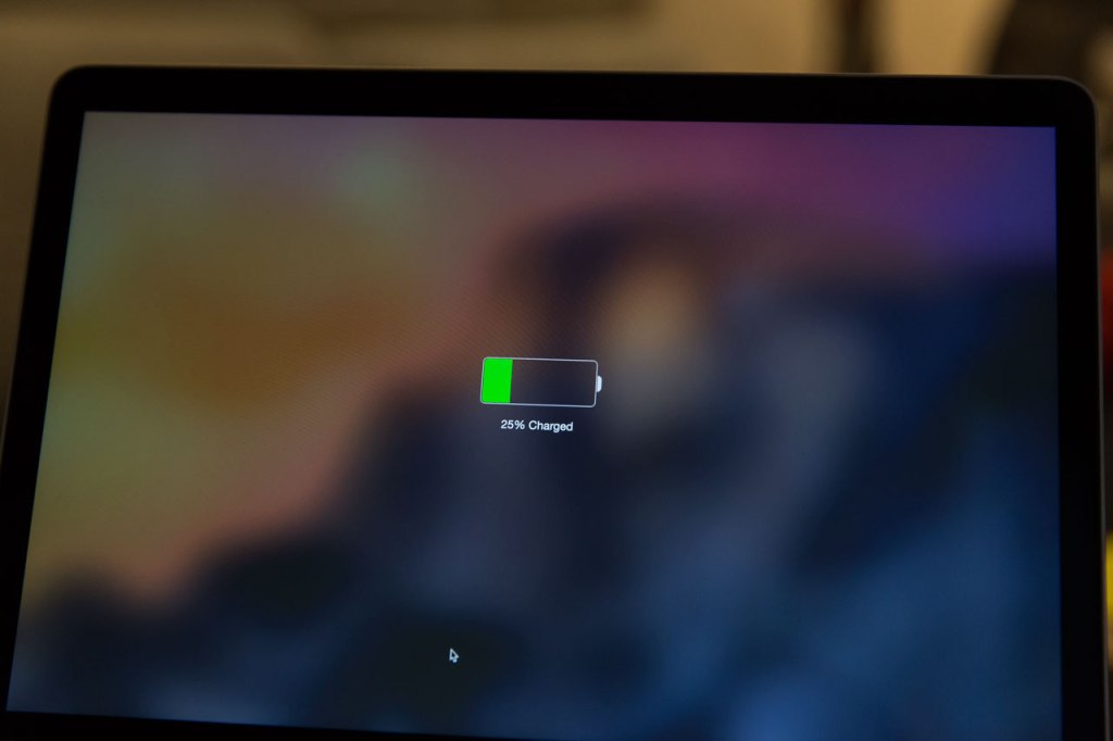
It requires a little more presence of mind than did MagSafe in terms of being careful where and how you leave the machine plugged in, but Apple has also added some tweaks that subtly guide you towards thinking about it differently: Plugging in doesn’t result in any kind of external light coming on, for instance, as it did with MagSafe. Instead, the MacBook makes Apple’s signature iOS ‘charging’ noise when you connect it to power, which is a quiet signal to your brain to treat it more like your mobile devices when it comes to filling up. And if you have the computer open but sleeping, you’ll see the charging graphic above appear on your display when you connect, also an iOS carry-over.
Performance
Handling Tasks
I came to the MacBook with certain expectations; specifically, that it would not be able to meet my more “pro” level needs, in terms of Photoshop, Final Cut Pro and Logic Pro. Luckily, the MacBook defied those expectations and performed well with each of the above applications.
Which isn’t to say performance is on par with, say, the brand new 13-inch MacBook Pro – it isn’t. But pre-launch concerns of this machine being seriously hampered by its low-power Intel M processor were, in my experience, very premature. The new MacBook handled the tasks I threw at it so well that I am now seriously considering whether or not I can adopt one full-time, as a replacement to my original 2012 15-inch Retina MacBook Pro road warrior.
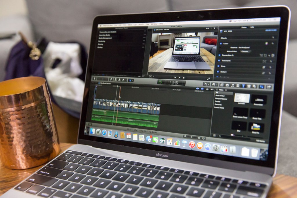
The video review above was edited entirely on the new MacBook, and the most painful part of the process was running video stabilization corrections on each of the clips used, which got the MacBook quite warm and also started eating battery at a frightening rate. And if you’re doing something more advanced than short videos with more or less single video tracks with voice over and a simple soundtrack, you’d likely appreciate more processing muscle.
But the takeaway here is that practically speaking, the MacBook does not feel hamstrung performance-wise because of the concessions Apple has made to ensure maximum portability, at least based on my existing testing. This is not the original MacBook Air part two, in other words, with trade-offs that served the future goals of the line but did no favors to original purchasers: It’s a powerful, competent notebook that can most likely do what you need it to do.
For those who primarily use their devices for watching video, browsing the web, using the new Photos app for organizing their picture library and other lighter tasks, performance absolutely exceeds the mark.
Battery Life
The MacBook’s battery offers up to 9 hours of Wi-Fi web browsing, according to Apple’s official specs, and 10 hours of iTunes movie watching. My own battery testing eschewed artificial playback and browser loop tests, and consisted of using the notebook the way in which I’d actually use a notebook, both in a mixed use while travelling scenario, and in more fixed, workstation-like and couch companion situations.
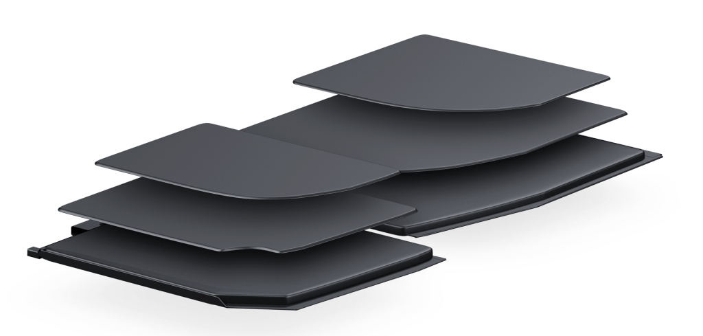
Apple’s terraced battery design for the new MacBook.
Battery life in the MacBook was such that I never really felt nervous or anxious about running out when using the notebook on the road. My first instinct was to find power and plug in wherever possible, but in keeping with the spirit of the machine, I resisted that urge, and once I got over that urge, I was pleasantly surprised by how long the power lasts.
In mixed use, leaving aside more intensive tasks like video editing, but including occasional Photoshop use and running the apps I normally use for work, including Slack, Safari, Tweetbot and occasionally Skype, I was able to get between five and six hours out of the MacBook on average, which is plenty for a standard day out of the office. In more casual, around the house occasional use, it was probably closer to Apple’s stated browsing maximum, especially with brightness keep below 50 percent.
The situation changes quickly when you start running things like Final Cut Pro for extended periods. While handling heavy tasks like rendering and outputting final versions, I could watch the percentage tick down with alarming quickness. Even still, I was able to edit, record voiceover for and export the review above starting out at around 36 percent without depleting the battery entirely – I ended up with about 10 percent remaining.
Display
The new MacBook has a Retina display, meaning Apple’s high-res tech has finally come to a device as thin and light as (and in fact thinner and lighter than) the MacBook Air. It’s hard to understate how awesome this is, but if you’ve been forced to switch back and forth at all between a Retina MacBook Pro and a MacBook Air, you’ll already know.
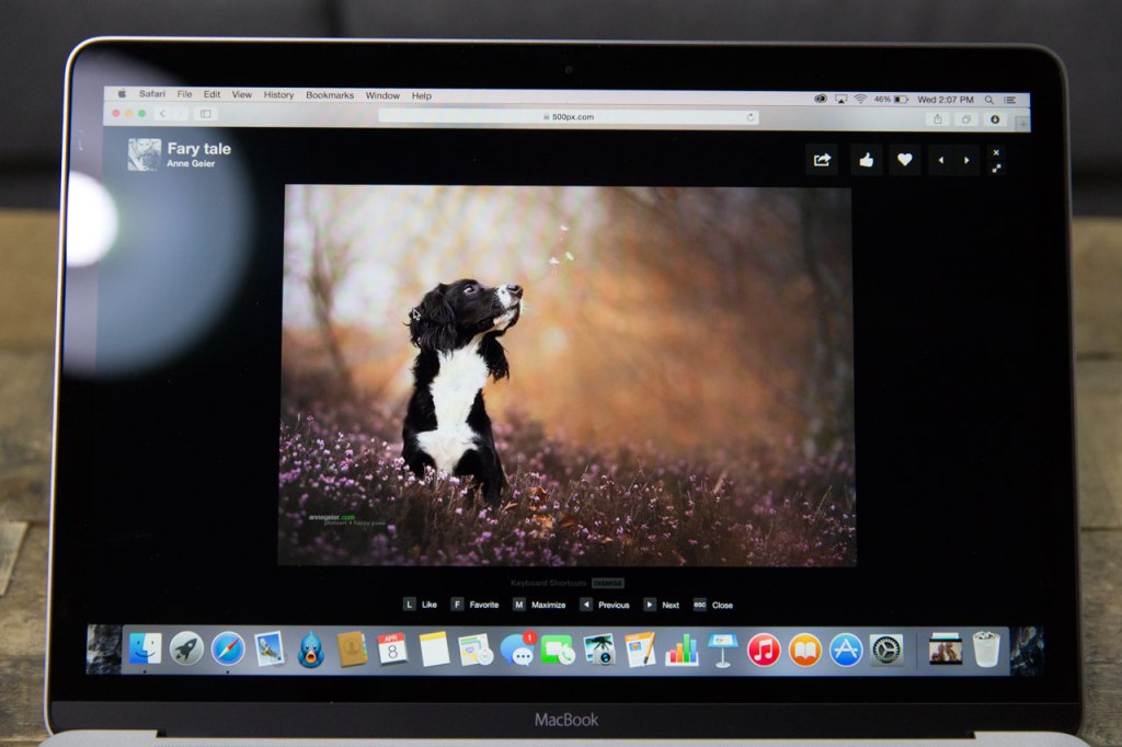
Apple’s display tech remains one of its crowning achievements, and in a device this small, with the minimal bezel and combined display/glass manufacturing technology, it makes a huge difference. The 12-inch diagonal display size isn’t as luxuriously roomy as I’m used to, since I primarily use a 15-inch, but I can still use two Safari browser windows side-by-side effectively with resolution dialled all the way up in settings, which is my primary need when on the road.
The display alone is a big selling point on this MacBook, especially for those who’ve been making due with the standard resolution screens of existing MacBook Airs or older notebooks.
Bottom Line
Apple’s new MacBook seemed like a shift so dramatic that it was bound to cause some discomfort when it was unveiled on stage in March in San Francisco, but in practice the big changes are far easier to embrace than you might expect.
It’s true that for users who treat their notebooks as their sole computers, and who like to plug a lot of things into those computers as a result, this probably isn’t the best option. But for people looking for a mobile Mac to complement their desktop machine, and for those who aren’t spending their whole day on their Macs for work (meaning likely the vast majority of general consumers), this is a future-oriented notebook that is just as effective in the present, too.


