Video Credits: Web Tools via YouTube
Image Credits: Sharon Lopez via Bitlanders
(Blog graphics created through Canva & uploaded directly to Bitlanders)
If you have your own blog, the last thing that you want to happen is for people who visit your site to leave without trying or even looking at what you have prepared for them. But the question is, did you incorporated a proper element in your blog to guide visitors do what you are expecting from them? This is the exact reason why website buttons may be beneficial for your blog.
Image Credits: Cheifyc via Pixabay
Buttons may appear to be just a simple form of ornament or design. But if you would learn how to create a more appropriate piece for your blog, the chances of higher engagement could be achieved.
Here is an example of a button that created with rich hover and interaction effects:
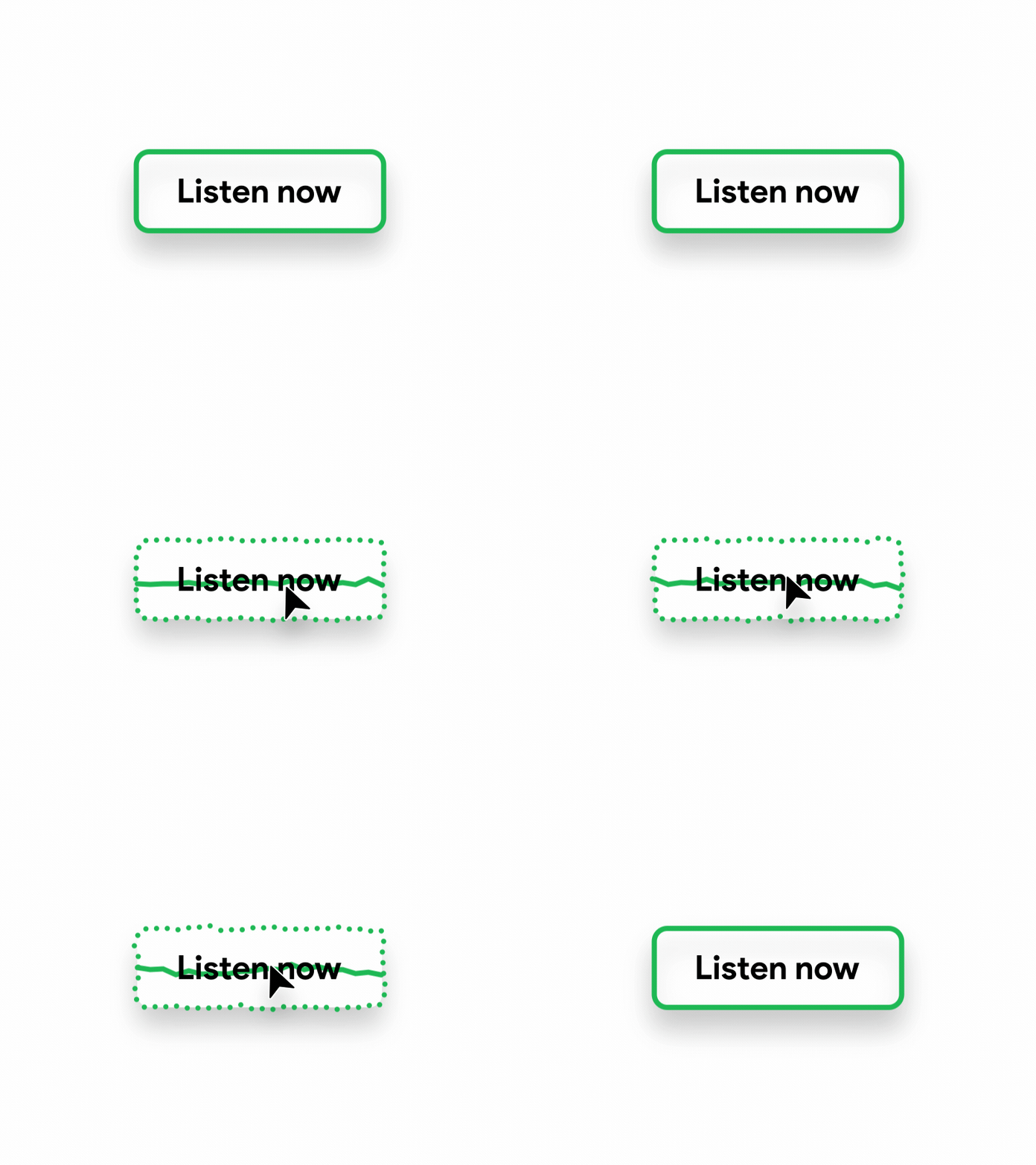
Image Credits: Mockplus.com
Whether your purpose is to sell a product, to generate more paid subscription or to have more people avail your services, having an appropriate call to action button is one of the best element we can add to our website.
Difference Between Button and Link
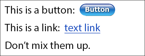
Image Credits: Webaxe.org
From the point of view of the reader, it could be easy to tell the difference between a button and a link. A button is a small shaped object place somewhere on the page that would let the reader perform a certain action. It can be round, rectangle, rounded rectangle or any shape with the same purpose. On the other hand, a link is a word or phrase with an attached URL that would lead the readers to other places when clicked.
In most cases, confusions rise among writers over to when buttons and links should be used. Thereby, they sometimes interchange the two.
When to Use the Button
If you are a blogger or a webmaster, you should fully understand when to use buttons and links in your website's interface. Remember, the button should encourage the reader to do a required action. That is why we should place a word or a phrase that denotes action. Moreover, we should also make the command clear and understandable. Please refer to the sample below:
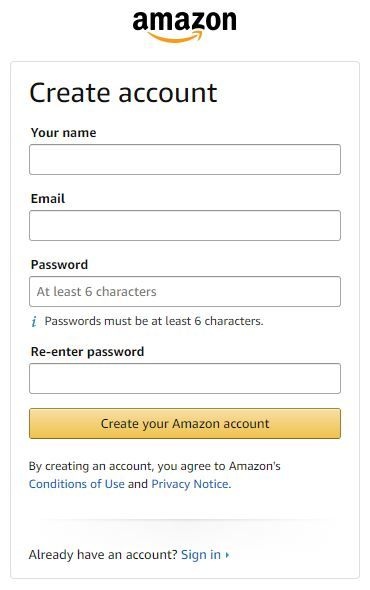
Image Credits: Amazon
In this image, it is clearly shown that before you hit the Create your Amazon account, it is expected that you already read the Conditions of Use and Privacy Notice which links have been placed just below the button. These links can be opened in another tab. Moreover, the button was designed to be activated after all the required details have been filled out completely and accurately.
Additionally, it is important to note that when a reader clicks a button, they are making an important decision. They can change the present situation because of a single click.
Buttons are best to be used when prompting the reader to download, buy something, sign up, subscribe or confirm a certain action previously made. On the other hand, we can also use a button to allow the reader to cancel an action and restart.
Here is an example of a button placed on the sidebar of a website encouraging the readers to follow another member or company. Once you click the button, you will not go anywhere else but will replace the text in the button as 'following'.
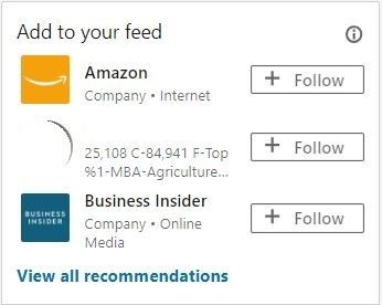
Image Credits: LinkedIn
(Screenshot directly uploaded to Bitlanders)
When to Use Link
A link is used for navigation. When a reader clicks a link, it would lead somewhere. But they are not changing anything.
I hope this simple explanation helped us in understanding the difference between a button and a link.
Now, we are ready to create buttons for our website!
Introducing Da Button Factory!
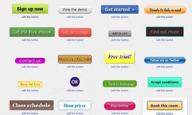
Image Credits: Da Button Factory
Having an application that could help create professionally designed, appealing and appropriate buttons for our website is a great help in achieving our goals. Da Button Factory is an online application where we can create personalized buttons for our website in an easy and fast way. Most of all, it is free to use. No need to worry about a monthly subscription fee in order to use the site.
You can edit the existing samples within the site or you can create your own.
How to Use Da Button Factory?
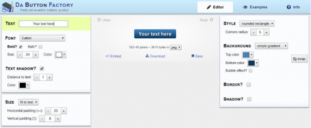
Image Credits: Da Button Factory
The site is very easy to navigate. When you visit the site, you can start creating your own button design and download directly into your PC or copy the code and embed it to your website.
The image above shows the editor where you can start by typing in the word or phrase you needed for the button. On the left side, you can find the option for the font type, size, color and whether you would like the text to be italicized and bold. It also includes options of having text shadow. Additionally, you can adjust the size of the button to fit the desired size of the text.
On the right side, you can find the option for the style of the button whether you would like to have a rounded rectangle or fully curved sides. The designed is preset to have a rectangular design.
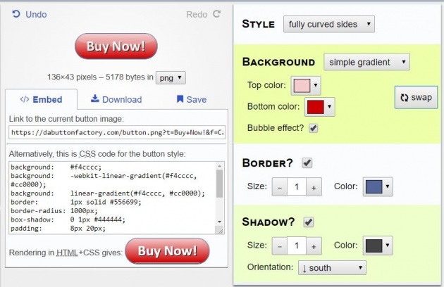
Image Credits: Da Button Factory
If you want to explore other designs, you can also use the existing buttons within the site clicking the examples and choosing from the given ready-made templates and have those edited based on your needs.
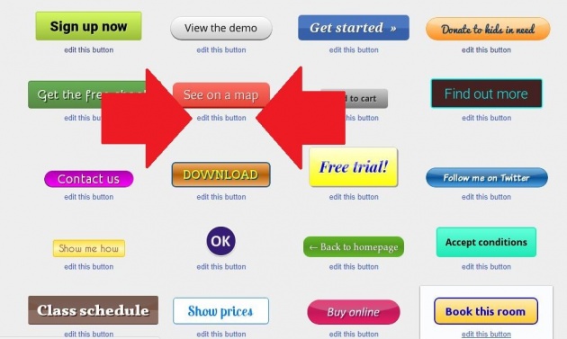
Image Credits: Da Button Factory (Edited with Paint)
The designs can be embedded directly on your websites or can be downloaded as png, jpeg, gif, and ico. You may visit the site here.
Here is another way of creating a button. Watch the video below:
Video Credits: Chris Walker via YouTube
On the final thought...
There are many ways to improve your site's performance in terms of engagement and interaction. One of these ways is to have a professionally designed interface and appropriate buttons. I hope with this blog post, I was able to share some knowledge that could help you in attaining success in your online career.
Thank you for the read!
More from this Author:
What We Need to Know About Retargeting
Forum Coin - Bringing Community Discussion to the Next Level
9 Brilliant Ideas to Help You Deal With Distractions While Working From Home
DISCLAIMER: The views and opinions expressed in this blog post are that of the author and does not in any way represent the agency or department she currently belongs.
ADDITIONAL NOTE: The sites mentioned in this post are for information purposes only and links are provided for easy access. The author does not receive any remuneration from the said companies or sites.
______________________________________________________________________________
Written for Bitlanders
by ♥Sharon Lopez
Date: September 07, 2018
Visit my blog profile for more ♥BLOG POSTS
Let's connect on ♥Facebook
Want to earn from sharing your opinions through blogging? Join us in Bitlanders and claim your 1 DOLLAR REWARD upon signing up. CLICK HERE TO JOIN

