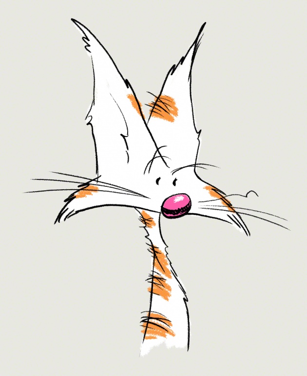
One thing to keep in mind when making a character of your own is how proportional it is to itself. How does one part relate to the others? What gives it unity? Appeal? A sense of functionality? Does it look good?
These can be tough questions when you're on your own, with no one to bounce the design off of or an art director to say "Nope. Do it again."
One method that's been used for years (centuries, really) is the heads method. Using the the size of the character's head, you can divine the rest of body's proportion and size.
Have a look at this great model sheet of Bugs Bunny from 1943:
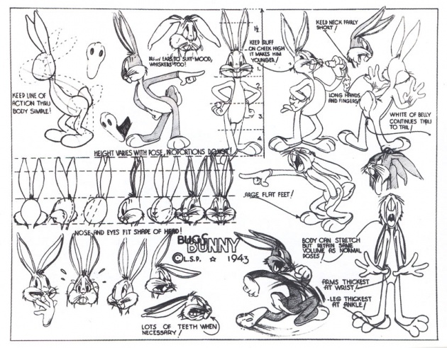
You can see how Bugs' whole body is measured out to 5 and a half heads tall. If you were to break it down even further, you'd find a proportional relationship with every feature on his face. Even the size of his hands and feet.
This is based off the real life relationship of a human being's features and proportions. Exaggerated for cartoonish effect of course.
Using something called The Golden Proportion you can create a very pleasingly proportional character. Then adding deviations from those proportions in certain places can create a great tension in the look of the character. Done right, you'll love looking at that character.
When I make a character I start from a place, depending on the idea, of either having something in mind or no place and I have to find the character.
For Pineapples, I've done lots of sketches to find his personality. They are all loose and sketchy and the proportion is all over the place. Then one drawing hit's it and I try to replicate it in another drawing. When I've refined the sketches and I think I have something I like, I have to figure out why I like it. Why is it working?
Then I start to break it down and try to mark out the proportions of the anatomy.
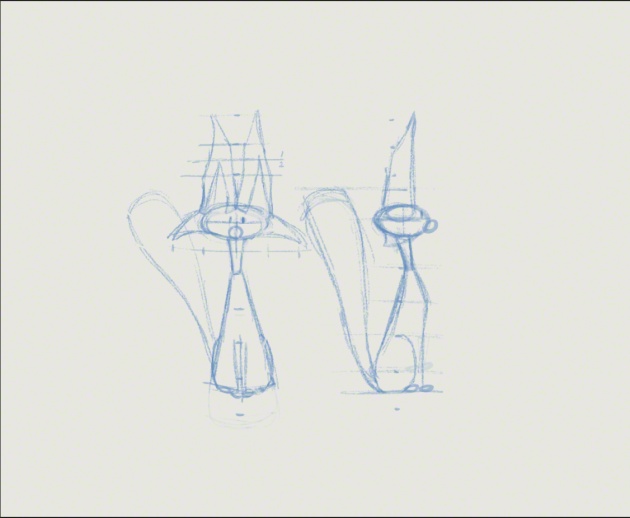
The above is a combination of 2 separate drawings scaled pretty close to each other. It's not exactly what I'm looking for in the design but based on some other sketches I think it's pretty close.
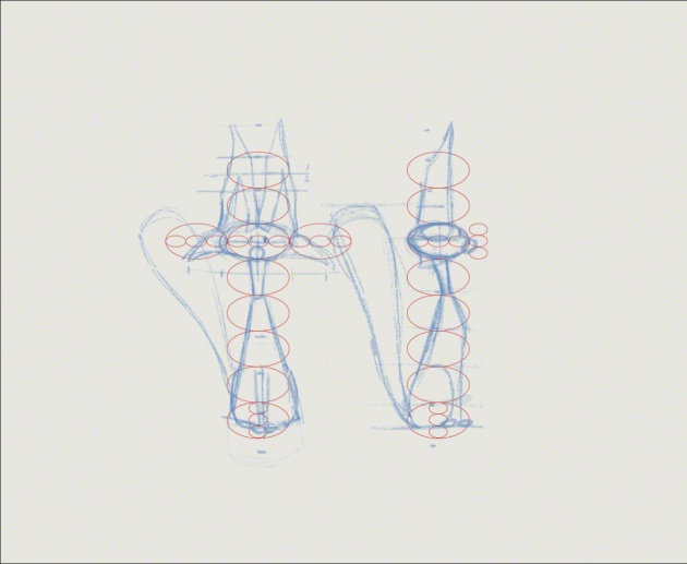
Here I used the size of the profile head to figure out where the things were working and not working. The sketches were completely intuitive and I didn't think about head size. But it's backed by years of drawing practice so it comes pretty naturally now.
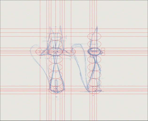
I broke Pineapples down further using the guides in Photoshop:
Now I did a more careful line to suss out the shapes of the body:
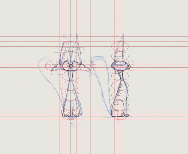
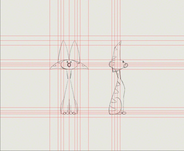
Now I have some shapes I can play with. I can use these shapes and proportions when animating Pineapples.
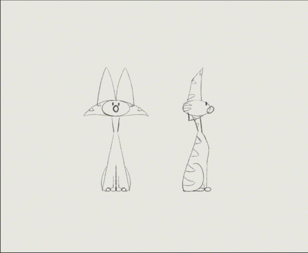
During the process I'll refine it more and more as I need to so the design works from all angles. Sometimes cheating the proportions to work from an odd angle is needed. This is perfectly fine as it's done all the time in the industry. You probably never noticed.
Because if it works, and looks good. Then it's right.
