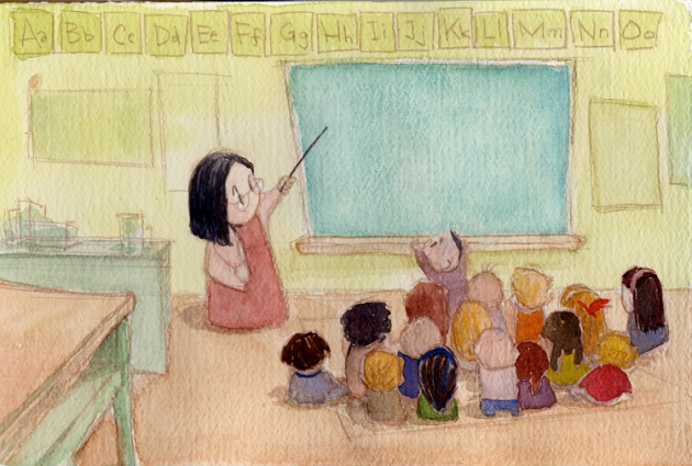
Here are some images from the earliest concept stages for my Sheridan grad film Sherry, like the Drink. The charcoal images were from an exercise from one of our classes where we had to use charcoal dust and tissue to get really loose and expressive. I liked the expressiveness, but I felt the mood and lighting was too dark for the purposes of the film.


I was satisfied with the direction of the simple, round characters, so I decided to pursue those types of shapes in more bright colour palettes. This purple watercolour painting was a bit closer, but still too sombre. It remained a meaningful piece of artwork just by itself, but for the film I needed to get something more fun and hopeful.

This was exactly what I was searching for. Once I created this image I tried to strive to create this feeling throughout the entire film. I kept this image posted around my desk and referred back to it repeatedly throughout the production.

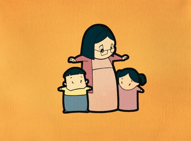
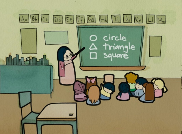
And the style eventually evolved into this bold, graphic, and iconic style. Final production stills from Sherry, like the Drink:


More images coming soon...


