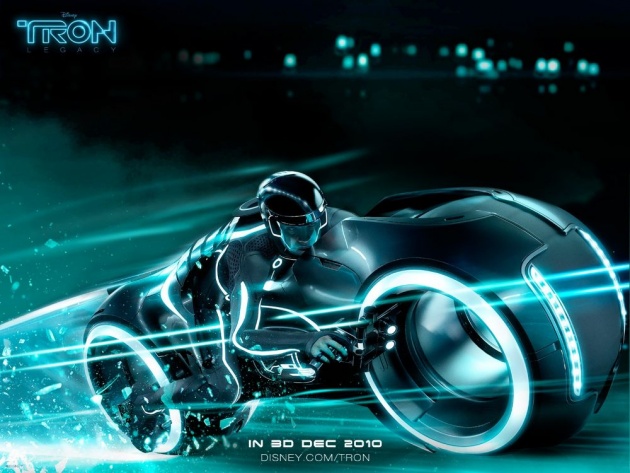
Tron Legacy Design

With the new Tron Movie coming out, I have very mixed feelings. I’ll be the first to admit that the first Tron movie is far from being a perfect film, but one of the main things it has going for it is it’s design. Syd Mead, Peter Lloyd, and Moebius brought some of the most amazing environmental and industrial design that film has ever seen. Design so severe that there isn’t anything like it in film to this day, and for one clear reason–minimalism. Tron Legacy has taken a very different approach.
When the original Tron team set out to design Tron, they were faced with their fair share of restrictions, but that wasn’t the driving force behind their decisions. They wanted to make a simple, clean and graphic world to illustrate the inside of a computer. They went out of their way to do so. Sure, the original lightcycle design was a compromise because Syd Mead couldn’t show the rider outside of the bike, but even his original design was as minimal as the one that made it in the film.
The landscapes were large, and expansive, but also very restrained. There was very little there to hint at what was going on. Some spires with rings around it, a hint of distance mountains, a grid for a ground plain, lines that might be describing a sea or a desert. That’s all that was there, simple, graphic, minimal, elegant, and we filled in the rest.
Flash forward to today: the new Tron. Yes, they have a very bleak palette, but if you look at the world, everything is there right in front of you, plain as day, completely spelled out, lush and obvious. The city looks like a realistic city, the sky is filled with realistic clouds, the interiors have reflections and real lighting. Everything in the film has real physics, the lean of the bikes, the air coming off the disks as they throw them. Where did the subtlety or finesse go? Where is the simplicity? Is this the best modern film can do? Is this entirely the designer’s fault? I don’t think so.
See, I’m pretty sure that modern audiences need this approach to design. I think that modern audience just can’t fill in the blanks themselves. We can’t have a hint of a mountain, we need to see the texture of grass, every rock, every drop of water in the river. We can’t hear about a battle, we need the camera to sweep across two miles and see one million yelling soldiers charging and zoom in to see every drop of blood spilled. Everything needs to be spelled out and obvious. Everything in stories needs to be explained and seen. We are jaded by modern design and information overindulgence.
We are surrounded and even surround ourselves with worlds that are obvious, realistic, and just boring. We need to have all the answers right in front of us, we can’t imagine or figure out things for ourselves. Nothing can remain minimal or mysterious. We can’t let our minds fill in the blanks. Just because we can see everything, it doesn’t mean we should see everything.
So, that’s why I have very mixed feelings about Tron Legacy. On one hand, I can’t wait to go to into that world again, but on the other hand, they will show me how everything in that world works, explain everything, show everything, make it realistic and boring. They will attempt to explain away the mystery and minimalism of the original film. But they are also helping the original Tron too.


