
Image edited in Canva credits: Jean Beltran via bitLanders
Just recently, I was telling @adgoggleko about the various Steem condensers available, several got their online websites while most are developing mobile applications both on Android and iOS.
While one may say it is quite complicated to create an app for it, the opposite is true because all applications powered by the Steem blockchain actually is an open source project, in fact, one can copy the source code of an open source project just as long the resulting project will also be open sourced.
Video credits: HyperFundIt via YouTube
So, today's blog is all regarding another Steem Blockchain condenser which I had been using for more than a month. I'll be tackling its functionalities, the things I like about it and what I believe can be improved.
What is Partiko?
Image credits: hyperfundit
I had made an introduction of the said application on my previous post on My Favorite Steem Blockchain Condensers!
Fast and beautiful mobile app for Steem.
That's how Partiko.app takes pride in this newly developed application. Currently, it works on Android and the iOS is still on its way, there are beta testers now and they are still looking for more to help them polish the application.
Developed by Sida, a software engineer at Airbnb, the application was developed in native code language for Android which made the app very light and fast!
Video credits: Happy Money Man via YouTube
I learned about Partiko from a blog posted by @happymoneyman who was enthusiastically introducing the app which he strongly believes that this is the ultimate Steem mobile application.
A Tour Around Partiko
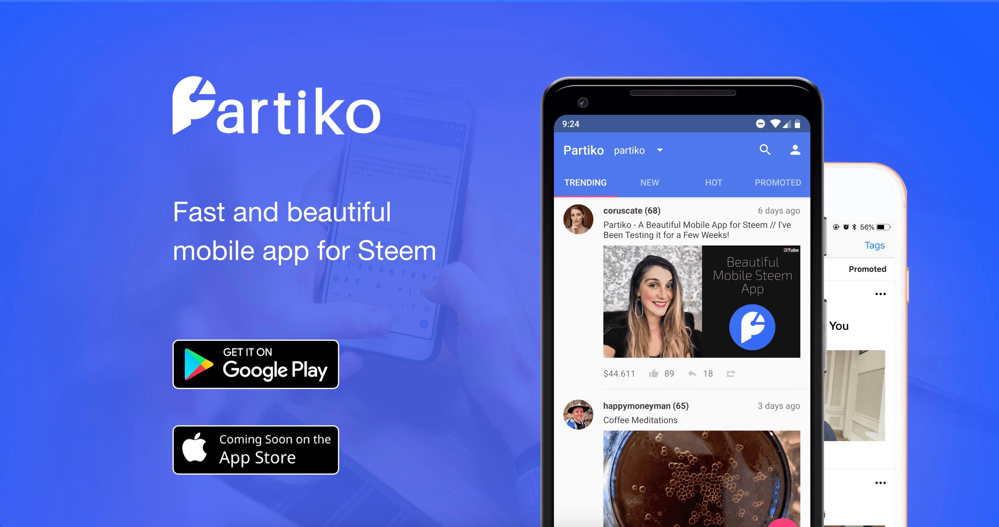
Image credits: partiko
Blue, White, and Pink - I personally like the color combinations of this application. I barely remember how I had entered my own Steemit credentials but for such application, but recalling my first ever review and confirming it through the Partiko site, it uses SteemConnect which makes sure that every private key and access token is not accessed.
Let's look into the app's certain section, in short, I'll be showing you around the interface. All images here are screenshots from my own mobile phone, by the way, just in case you are wondering.
Home Page/Feed
Clean, neat, minimalistic and fast!
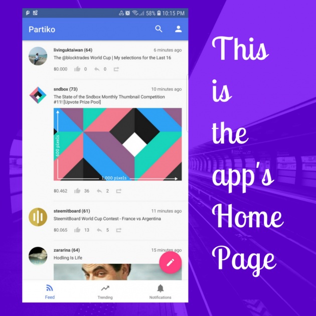
Image edited in Canva credits: Jean Beltran via bitLanders
That's my first impression and I love it because with all other apps which I used had some quote and quote complicated and overwhelming for me but soon, after multiple usages, I was able to adjust. However, with Partiko, just one look and you'll easily know where to go and what to do. It's simple and very comprehensive.
But actually, there's no specific thing as a home page, the feed itself works as the home page itself. All the blog posts here are those from all users whom I had followed and the items which were resteemed by those I follow. By the way, resteem is the term equivalent to share on Facebook.
In this page as well have all the other icons which allow the user to go to different sections of the app. There's the search, profile, trending, notifications, and create a blog. Additionally, on the upper left-hand shows the word Partiko.
See? There are only limited sections and that's making it simple, easy to navigate and very minimalistic! My eyes were pleased with what I was seeing!
Search Icon
There's nothing much to talk about the app's search icon. As what normal search sections do, this showcased nothing but the search field, the search results which is blank on first opening and there isn't any search button because the user has to make use of the phone keypad's enter key or search key.
The data searched usually shows the users first, then the posts come afterward. Clearing the search data is quite simple too by just pressing on the X button. To go back to the Home page or the feed, the arrow back can be selected.
Profile Section
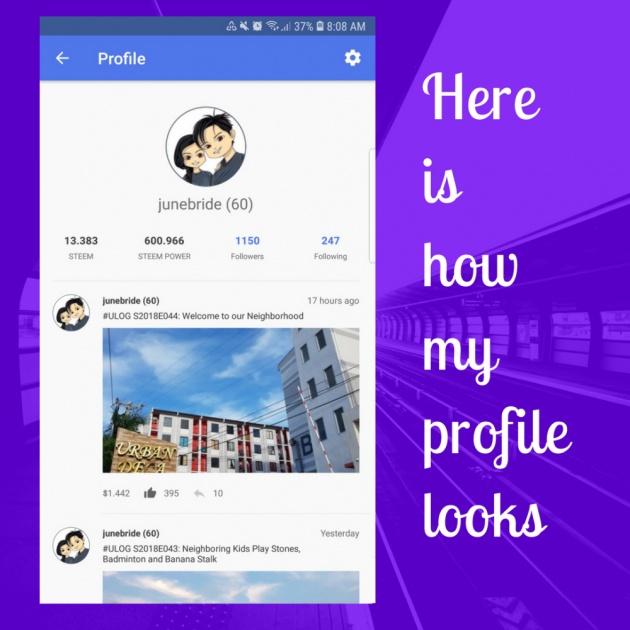
Image edited in Canva credits: Jean Beltran via bitLanders
Obviously, this is for my own account's profile information. The topmost part has my profile picture, my account handler and the reputation, as seen in the image above, I currently have a reputation of 60.
Below shows my Steem balance, Steem Power, number of followers and those that I have followed. Then my blog articles come into the next part after the line from the most recent articles to the oldest. This also includes the blogs I resteemed or shared.
The other option here is the gear icon on the top right-hand side which signifies the settings but this only shows two options: Feedback and Sign Out. So the first part is where a user can send his or her feedback or reviews about the app through an external email application. Sign out is pretty easy to understand what or how that functions.
Trending
Back in the home page, this is what looked very similar to the home page, it has all the options that the home page shows except for the sections Trending, New, Hot and Promoted.
The trending section is for those which has the article with the biggest earning and the most liked or in this case, upvoted.
New is obviously is the part for all the newly created or submitted blog posts.
Hot means the posts which are new but are already has a good amount of earnings.
Notifications
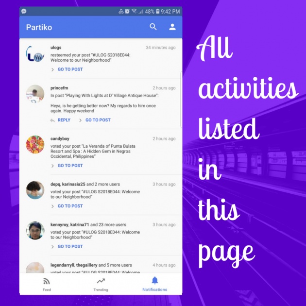
Image edited in Canva credits: Jean Beltran via bitLanders
My favorite part though is the notifications page which has all the details and activities from the other users like if someone upvotes or likes my blogs, resteems or shares, comments and even those who had just started following me.
Inside this page shows the same sections like that in the home page except for the create blog icon. But the good thing here is that you can reply directly to a comment or go to the post.
If one presses the go to post, it navigates to the post details to show the posts. Inside, one can upvote the article and comment as well as share it too. Plus, it also has the option to share it outside the Steem blockchain, to social media and to a separate browser.
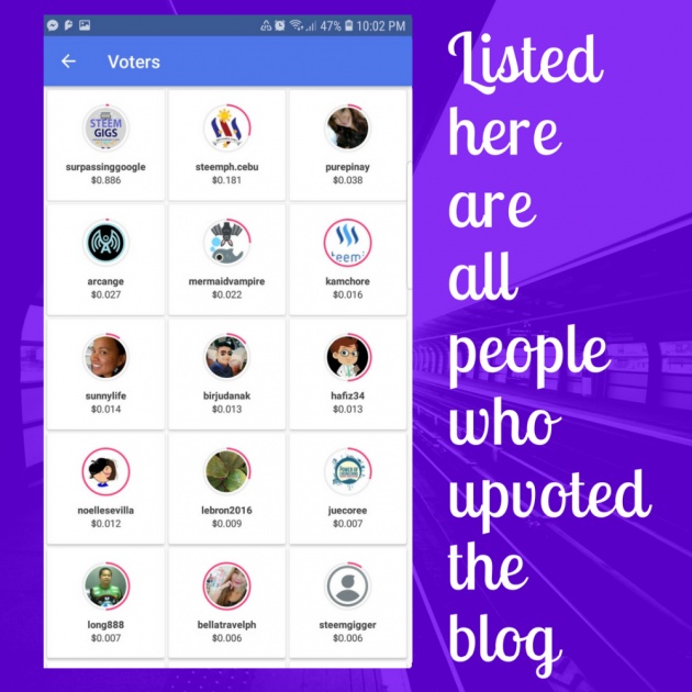
Image edited in Canva credits: Jean Beltran via bitLanders
The cool thing here is that if you have reached more than 500 Steem Power, the slider is available to choose how many percents would you want to give to the article author, it also has the ability to show you all the users who had upvoted the post including the corresponding percentages.
Create a Blog
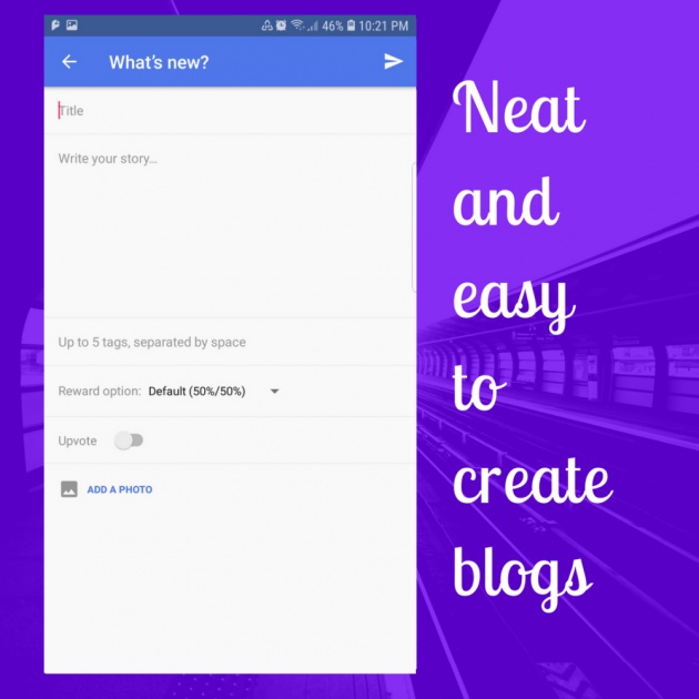
Image edited in Canva credits: Jean Beltran via bitLanders
I love that this is really straightforward. There's a text box for the title, another bigger text box for the entire story to be entered, the tags section, the reward option comes in too, the auto upvote and add a photo button.
At the top right-hand shows the button to submit the article. This icon actually gives me the feeling that I am sending an email because of the paper plane icon!
What to Improve?
I greatly love the application! In fact, out of the other apps, I have installed, this is the only app which I allowed push notifications to my device. So far, I have no issues with battery draining or whatsoever. However, just like any other application, this has a lot more things to improve.
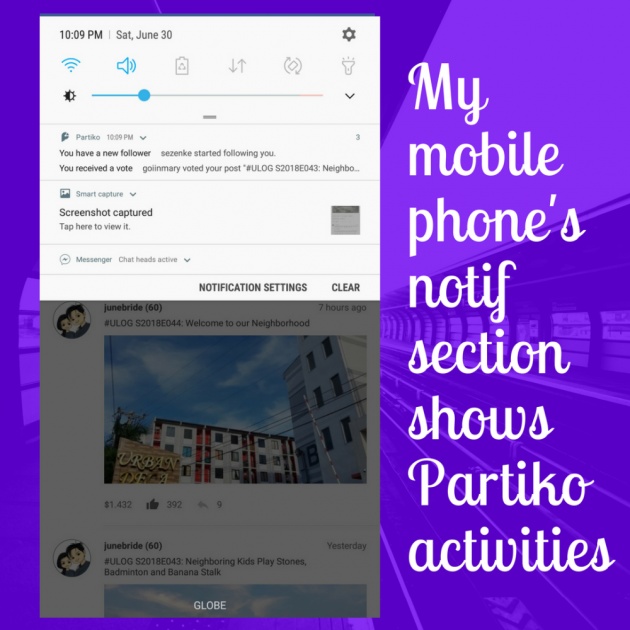
Image edited in Canva credits: Jean Beltran via bitLanders
One of which is the option to view a user's wallet. The Steem Blockchain allows transparency and being able to view each user's wallet is one freedom that we enjoy. Anything fishy will definitely be caught because of this feature.
Another thing is the ability to add more than one image. I really dislike posting a blog with just one image, perhaps because I am used to adding 10 images with bitLanders so as much as possible, I should be attaching more than one.
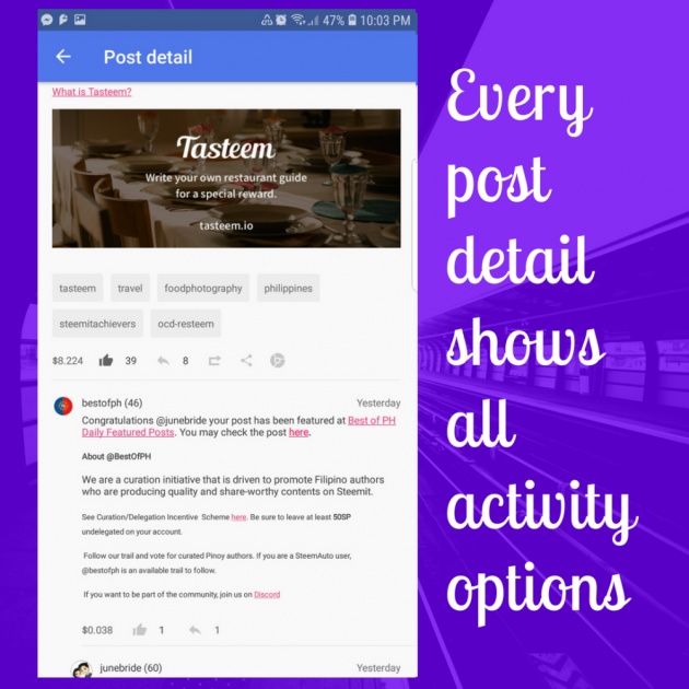
Image edited in Canva credits: Jean Beltran via bitLanders
The last point is to perhaps change the upvoted icon color. Currently, its colored light grey, when upvoted, it switches to a darker shade which is still confusing. My friend @adgoggleko had the same sentiments though and she also had pinged the developer about it.
The good thing though is that the Partiko developers are constantly updating the app, opening up new features and I am excited to have that option available in the future.
This blog entry was written and published by Jean Beltran-Figues for bitlanders.com.
Join me, click here to sign up.


