Recently, I read an article on one of Kubrick’s signatures in film – the one point perspective. Bunkers, hallways, snow mazes, and long, tubular space stations were all perfect settings to draw our eye exactly where Kubrick wanted it to go: the dead center of the frame.
(from “The Shining” and “2001:A Space Odyssey”)
I’ve been thinking a lot about framing in my film work this year. Hand-held camera work artistically has its own merits, plus it’s quick and easier. But this year, I’ve sort of rediscovered my tripod, and have put a lot more thought into framing than two shot, wide shot, and making it look pretty. This might seem like Film 101, but you can get away from things, or start to focus on other things or hire other people to do your framing, and before you know it – it’s a lost part of your filmmaking process. Now, I’m not walking around with my thumbs together and index fingers in the air putting everyone in my frame – that really doesn’t work anyway.
But I am thinking more about the edges. When I shot the TITANIA Dream Scene, I had the paintings of Andrew Wyeth in my head. And the drawings of Gustave Dore. Big, wide landscapes that sweep up their subjects. It works for this scene because Titania is supposed to be overwhelmed by the sudden change in the landscape surrounding her home.
 (from the TITANIA Dream Scene, 2008)
It gives the audience perspective and a metaphor for how she’s feeling. Same with “Lust” (HELL). I could follow a woman around with my camera and you’d get the idea that she was uncomfortable every time she looked back over her shoulder, but if I trap her between two men and the ocean, you know immediately how limited her options are.
Hitcock’s “Rear Window” is one of my all time favorites. I think a big reason is because of how it’s framed, literally out a window, and into other windows. All these little tableaux playing out before you like peering inside a little wind-up toy and discovering a murder!
The whole point is you can’t look away. It’s mesmerizing to see what can take place inside of one box. (Sidebar: if you haven’t seen Rear Window re-edited in a One Frame Timelapse, check out this piece of genius from Jeff Desom – Rear Window Timelapse)
In an earlier blog post I mentioned that film comes in all shapes and sizes. Framing has a lot to do with that. I think of Alice, grown so large she can’t fit in the Duchess’ house – her arms and legs sticking out the windows. But she hasn’t just outgrown the walls of the house, she’s outgrown the frame of the film, the edges of the drawing. For a moment she is confined, and for an hour or so the stories of the Rear Window characters are confined to their windows. They make us very aware of the parameters of the space by which we are watching them.
The window image here is a frame grab from a film I’m working on. When I set this shot up outside, my actors and I couldn’t hear each other, I just gave them a hand signal when we were rolling, and let them go. Let them tell their story, through the window without cuts – a beautiful and heartbreaking nighttime tableau. (I’ll post about this film in a few weeks) The moment sort of reminded me of “Sleep No More” – the brilliant stage production of Macbeth now playing in NYC – where you run from floor to floor following characters around in a seamless and frightening tale of guilt. Though there are 6 floors, you are very aware of the boundaries and where and where you can’t go, of what’s before you and what’s behind you. A heightened sense of personal space. I guess putting a proper frame on a tale in film is sort of a heightened sense of visual personal space. The camera lens disappears and perspective takes over. I want to tell you where to look – through this window or through this spyglass. As I’ve done with “The Jules Verne Project”. You are watching the film from the viewpoint of the evil mastermind who is menacing the castaways.
(The Jules Verne Project, 2012)
Which brings me to another project I’m experimenting with that will be out on Oct. 19th. I’ll be playing with framing and viewpoint – forcing the audience to become participants. Start watching for news of that on Oct. 5th. A Halloween treat for all!
Back to framing… A few years ago director Kelly Reichardt made a film called “Meek’s Cutoff”. It’s a Western that takes place in 1845. She stepped beautiful outside of convention and filmed it in a square ratio (most film is 16:9 ratio, tv used to be 4:3 – more square – but is now more rectangular like film). She did this so the film would look like old 19th century photos. And it’s beautiful! You can watch the trailer here: Meek’s Cutoff Trailer
(Meek’s Crossing)
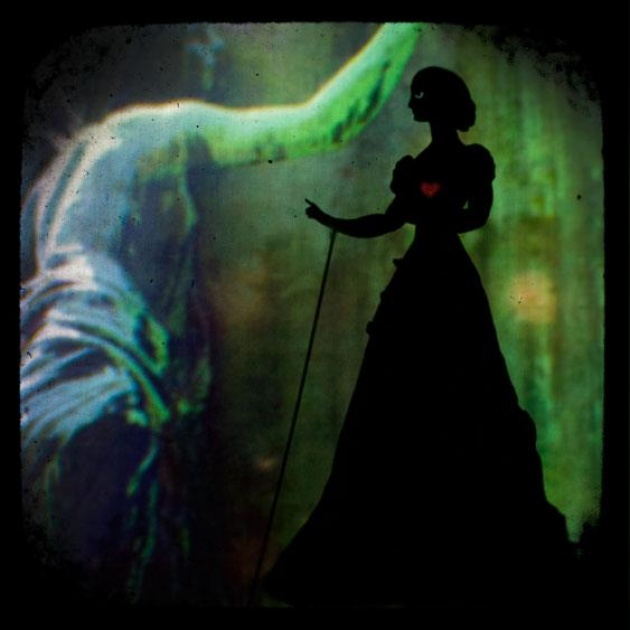
I think a lot of our association with history lies in the shape of every day objects. From the square photos, to the elaborate curls of handwriting on letters, to the frame their clothing created… When Connie Toebe and I started working on “The Weeping Woman” we decided to give it a very vintage feel. The ttv photos Connie took for the backgrounds are all square with clouded borders, so we deliberately shot in 4:3 to maintain that framing. If we had shot in 16:9 it would have had the look of an old story set in a modern perspective, but we want the audience to feel like they’ve opened a 100 year old book of photos that have come to life.
(The Weeping Woman, 2012)
I’m having fun with this! And really look forward to pushing my boundaries with the Halloween project. And I have another idea in my head. Sometimes when we keep the camera still, it gives you more creative choices as an audience member. Maybe the first time out you look through the window and watch the characters, the second time through you look to see what’s hanging on the walls, and the third time you watch it – you notice someone hiding in the corner you didn’t see before. It’s make my job more fun too – the more details you can add the more fun. So, we’ll see where coloring inside the lines takes us, yes? :)


