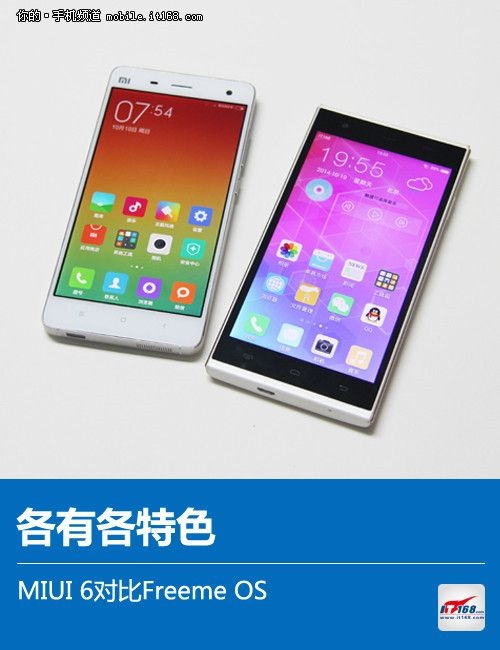
These days, it is not just cellphone manufacturers that are producing third-party operating systems. Even non-cellphone companies are doing it too. Take, for example, the new Freeme OS. An OS can be evaluated based on aesthetics and its functions, that is, whether it looks good or whether it is practical. Here we will evaluate the Freeme OS by comparing it to another influential third-party OS, the MIUI (we will use the latest versions for both, the MIUI 6 and Freeme 4.0).
Interface
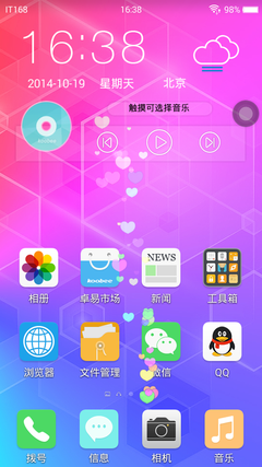
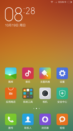
Since the release of the iOS7, many re-customized operating systems have been copying Apple by adopting a “flat” design. The MIUI 6 and Freeme are no exceptions. Furthermore, both only have a one-level menu. The MIUI 6’s interface is similar to its predecessor, the MIUI V5, with its simpler-looking icons. The Freeme OS has already reached been upgraded to its fourth version.
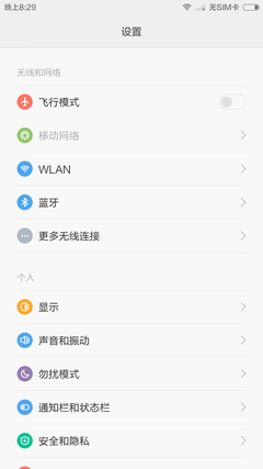
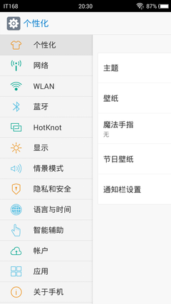
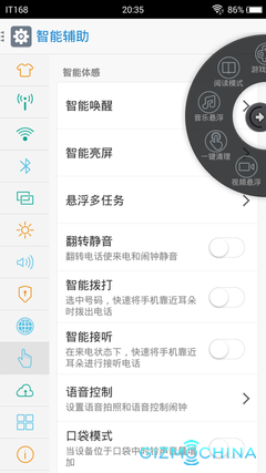
Regarding their settings menu, both OS have a white background with a black font. The MIUI 6 uses a bold font. Furthermore, the MIUI 6’s settings bard is divided into blocks. You can change from one part of the settings menu to another by just touching its block. The Freeme OS, on the other hand, uses a similar design to the Meizu Flyme. You can change the text describing each tab by scrolling your finger left to right. Furthermore, the Freeme OS has the settings menu divided into two blocks. On the left side is the basic Settings menu, while on the right side is the expanded menu.
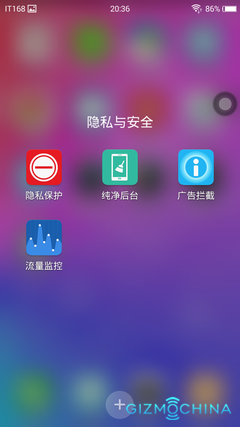
On appearance, the design of the newcomer, the Freeme OS, is not as exquisite-looking as the experienced MIUI, but it still looks good. If it makes some improvements later in things such as the font in the menus, then, it would probably become more beautiful.
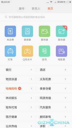

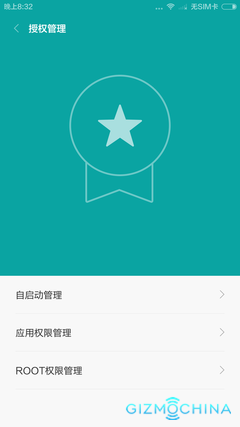
The MIUI usually offers more services. The MIUI 6, for example, promotes many internet services such as Xiaomi events or yellow book functions. The webpage version is filled with all kinds of services.
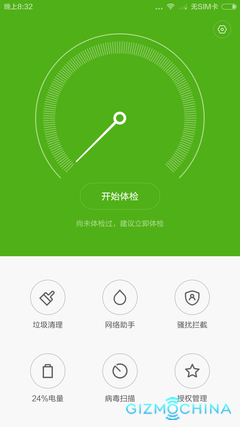
Through its partnership with Cheetah Mobile, Xiaomi also added new upgrades with the MIUI by adding a trash bin, internet assistant, power management center, etc.
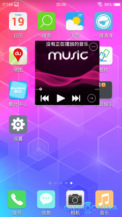
The Freeme is not without its strengths as well. One of Freeme OS’ best features is its letting its multi-task menu floating over the interface, similar to iPhone’s Assistive Touch. In the screen, there is a small white circle that you can click to open the multi-task function. However, unlike with the iPhone, the multi-task bar shows apps such as the calculator and video player. It’s very practical.
Conclusion: After several years since it was first launch, the MIUI has changed and improved a lot over the years, while the newcomer, the Freeme OS, still has a lot of catching up to do. Still, it’s not off at a bad start and may still improve over time.
Source: http://www.gizmochina.com/2014/10/20/freeme-os-vs-miui-6-an-os-comparison/

