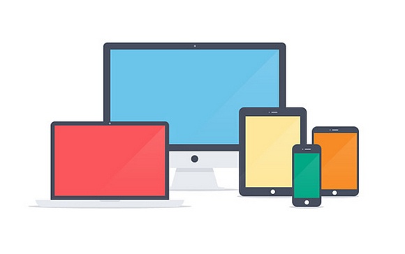
Nowdays is really easy to find websites, landing pages and social profiles adopting the Flat Design style.
So, how to create a good Flat graphic?
Colors are the first thing: radiant and strong, crayon-like, for a shining eye-catching webpage.
Flat Designs "broke down" the tradional graphic theories: it's now common to find a flat website using more and more colors, when in the past every website used just two or three colors, usually shades and derivates.
Well, I'm not saying that you should use too many colors, but to use them wisely: that's why you should always rely on a good web designer, someone who could suggest you what will suit you better.
From a graphical point of view, the Flat Design arrival brought with it the decline of (almost) every effect, glow, shadow and shade.
When choosing the colors, I would suggest you to use FlatUiColors. Try it, you will love it!
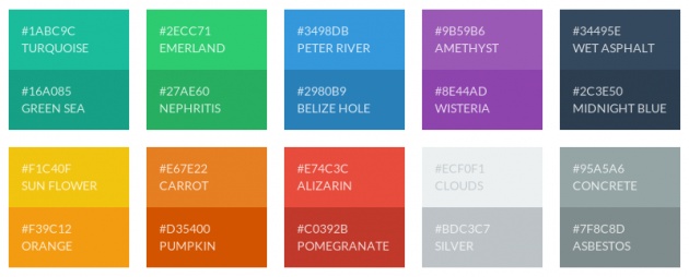
Clicking on a color will show you the HEX or RGB code. Fast and easy!
Everything should be "flat", not only the colors.
That's why every element of the webpage (buttons, menus, borders, etc.) should be simplified, removing the "classical" design details.
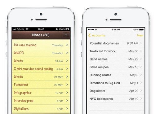
In the past, it was common to accurately reproduce real life objects, just think about the iOS6 Block Notes: yellow background, stitchings, horizontal lines. Just like a real paper agenda!
A last tip? You can still use rounded corners and shadows. The Long Shadow Design is a good example: long shadows and shades, but still... Flat!
![]()
Texts should be Flat aswell. How? I'm talking about the language: try to be simple and direct, it will be easier to reach your target audience - and your potential clients.
That's all for today. Follow my tutorials using the hashtag #pillolediwebdesign.
See you at my next tutorial!
Alessandro Frangioni - SEO and Freelance Web Designer
www.bitly.com/filmannex - www.filmannex.com/alessandro
Articolo originale: http://www.filmannex.com/blogs/linee-guida-per-un-buon-flat-design/244971/
Traduzione dall'italiano a cura di Nadea Translations.
Vi è piaciuto questo blog? Vorreste entrare a far parte della comunità di Film Annex, il primo Social Network a premiare economicamente i propri utenti? Nulla di più facile. Seguite questo link!

