Image Credit: @artbytes via Bitlanders
As a student or a working professional, at some point in your life, you will need to create a PowerPoint presentation.
From what I have observed, however, many people do not know how to make an effective Powerpoint presentation. Some are too simple, while others are too complicated. Some contain too much information.
What is the purpose of Microsoft PowerPoint?
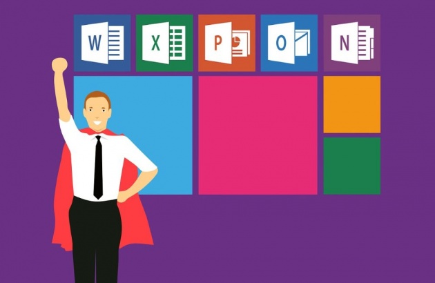
Image Credit: mohamed_hassan via Pixabay
Before I proceed with the details of making an effective PowerPoint presentation, let's first define the very purpose of the program.
The main purpose of the program is to enable the user to create a dynamic presentation that uses texts, images, and animations in the form of slides.
A slideshow is a form of visual aid that would help the oral delivery of a subject.
Keep this purpose in mind as you continue to read this post. I will detail some key points on how to make an effective PowerPoint presentation.
image credit: https://pixabay.com/en/employee-learning-development-3005501/
How To Make An Effective PowerPoint Presentation.
1. Keep it Simple.
Keep your design simple. Over sophisticated design might distract your audience. However, if you make it too simple, you may also lose their attention. To keep it simple yet engaging, add only elements that have functionalities.
- Don't use fancy font styles. They might be difficult to read.
- Make your design uniform.
- Use the same font and background throughout your presentation.
2. Use bullets and summarize the information on the screen.
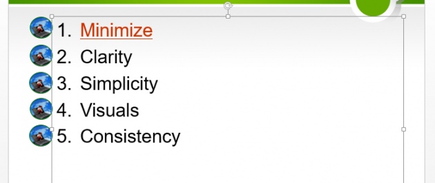
Image Credit: by @artbytes via Bitlanders
Bullets could help you emphasize important points. Instead of including every word and details in your presentation, summarize the content.
A common mistake is presenters would often include everything in their presentation. This will have at least four undesired effects on your presentation.
- You will end up reading everything from the slide, and;
- Your audience will be tempted to read from the slide instead of listening to you.
- You will end up with too many slides.
- You might end up using smaller fonts.
Remember a PowerPoint presentation is just a visual aid. Most of the information must come from you and must be delivered orally. It is not a written report that you copied to your presentation.
3. Minimize the number of slides.
Keep the number of slides to a minimum. I have seen quite a number of presentation that contains too many slides than necessary.
One reason for having too many slides is having too many information on your presentation.
4. Make use of the speaker's notes.
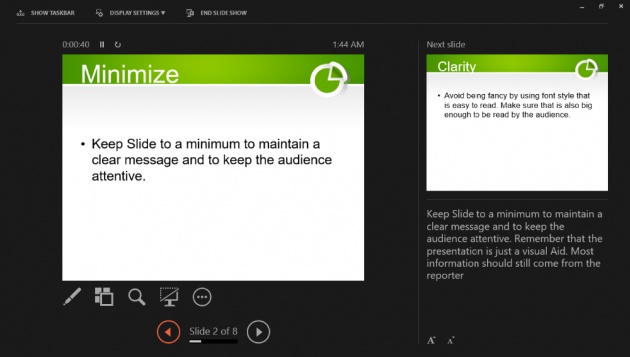
Image Credit: by @artbytes via Bitlanders
When you have two screens, you need to use the extended mode of your screen to make use of the speaker's notes. A speaker's note will only be visible to your main monitor. This is called the Presenter View.
Here is a short video by Skillpath, showing how to use the speaker's notes and the presenter view.
Video Credit: @SkillPath via YouTUBE
Using the Presenter View will enable you to read your notes while looking towards your audience. If you have only the important points on the slide, the audience will also keep their focus on you instead of reading the content of your slide.
5. Use Graphics Related to Your Presentation

Image Credit : @MediaModifiervia Pixabay
"A picture paints a thousand words." That's what they say. Indeed a graphics or a picture could help you clarify your point. However, never use images that are not related to your presentation.
6. Use videos when available
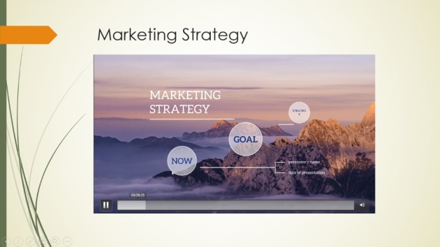
Image Credit: by @artbytes via Bitlanders
Like graphics, videos would also help make things clearer. One advantage of using videos is this will take the monotony of your presentation. Another advantage is you could rest your voice for a few moments.
7. Use Charts instead of tables.

Image Credit: by @Stocksnapvia Pixabay
Showing the data using charts is much better than presenting them using tables. It is much easier to show the trends or the data can easily be compared.
8. Color contrast.

Image Credit: by @artbytes via Bitlanders
Make sure that you use light text color over a dark background or vice versa. If you are using a colorful background image, use a shape with a solid color in between the background and the foreground.
Also, don't use colors that are too bright or color combinations that will make your fonts difficult to read.
9. Make a Clickable table of contents
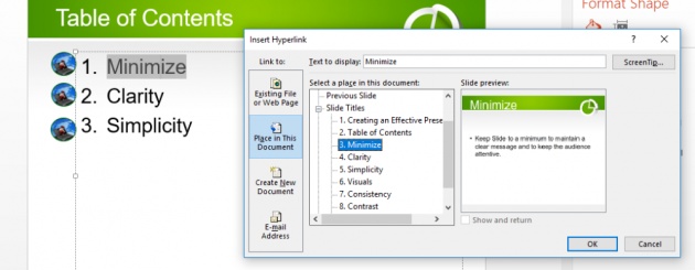
Image Credit: by @artbytes via Bitlanders
A table of content could make your presentation appear more organized. And making a clickable table of contents would allow you to jump from your table of contents to any section of your presentation.
How to Create A Table of Contents in PowerPoint
Adding a clickable table of contents is not as difficult as it may seem. All you need to learn is how to insert a hyperlink.
With a hyperlink, not only it allows you to link to a webpage or an existing document. To make a click a table of contents, follow these simple steps.
- Make a table of contents by using a numbered list.
- Highlight the text of the first entry or section.
- Right-click and select "Hyperlink"
- Select "Place in this document"
- Select the appropriate slide for that section.\
- Click "OK".
- Repeat the process for each section.
Don't forget to create a link back to the table of contents for each slide.
Here is a short video showing how to create a clickable table of contents.
Video Credit: @UCHgbs via YouTube
Your PowerPoint Presentation is Just a Visual Aid.
In making a PowerPoint Presentation, keep in mind that it is just a visual aid. You do not need to put every information of your report on the PowerPoint Presentation.
Your presentation is a guide for you so you could deliver your message in an organized manner. It should also help your audience focus and remember the important key points of your presentation.
What is more important is how you deliver the report orally. Having prepared a good PowerPoint presentation will help you keep your audience's attention to you. Otherwise, they will end up distracted or they will be tempted to keep on reading your report slide after slide.
This is it for now. I hope you find this short PowerPoint tutorial on how to make an effective PowerPoint presentation useful and help you deliver your presentation successfully.

Image Credit: robinsonk26 via Pixabay
Thanks For Reading.
Reference:
http://www.simpopdf.com/resource/what-is-Microsoft-powerpoint-used-for.html
Disclaimer:
Most of the content presented here is based on the author's experience in the subject. References and videos are credited to the source as indicated.


