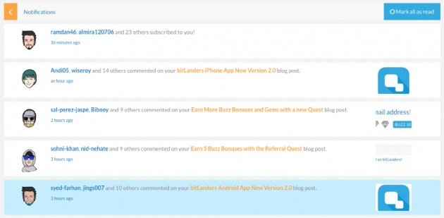
We made Notifications more user-friendly!
Interacting with your subscribers has never been easier! With the new Notification system, you can now:
- See notifications grouped by type. For example, you'll see one notification for all comments made on one of your blogs, and another one for all comments made on one of your videos. All your new subscribers will also be displayed in the same alert.

- See the time of the notification.
- Mark all notifications read in one click, or individually by clicking on the small circle icon at the top right.
- Hide notifications by clicking on the "x" icon at the top right.
All non-read notifications will now appear in blue, while the ones you marked read or clicked on will go to white.

To access your notifications, simply click on the "bell" icon at the top left or click here.
This new system takes effect on the main platform, mobile site and both Android and IOS apps.
- Micky


