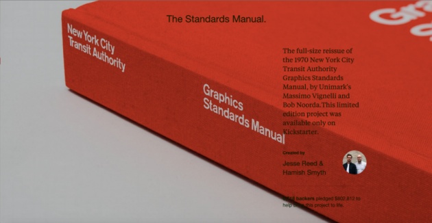
Kickstarter has a new project page layout called Spotlight that acts as a showcase that outlasts each project’s actual crowdfunding campaign. The new Spotlight landing pages put much more focus on the results of the projects themselves, with pages that can be changed by the companies and individuals who ceated the campaign to reflect updates to the story.
The new landing pages can also be used by project creators to direct traffic elsewhere, meaning you can more easily point people to your storefront is the product you Kicstarted is now a shipping gadget, for instance. The layout tools available to project creators also now includes a timeline feature, which provides updates from most recent back to the original project creation, giving creators an easy to way highlight big moments in their projects history and key milestones like ship dates.

There’s a decent amount of flexibility despite Spotlight using a fairly common template across all projects, making it functional regardless of whether you’ve funded an iPhone accessory, a book of poetry or a live art installation.
For Kickstarter projects that truly take off especially, their project page becomes a more or less permanent destination in terms of search traffic and backlinks. The company’s decision to help project creators do more with these pages once their funding period is completed is a good way to both KS and its users hi light their big successes.


