A few years ago, I did a lecture series on how to promote yourself as a film maker, and more importantly your short films.
So if you are wanting to do more with your films other than make them and show them to your gran, get planning. Oh and find a decent graphic designer.
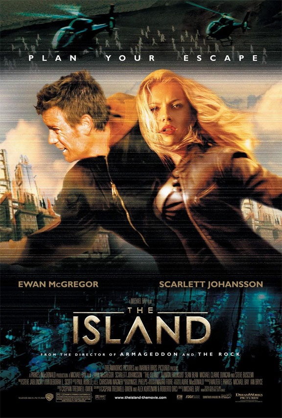
How many of you thought The Island was a porn film from the cover. Indeed the marketing was partially to blame for the miss fire of the film at the box office.

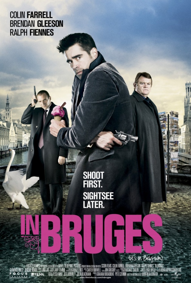
I thought this about In Brugee. The trailer, and the poster with its pink text and sky blue background give you a feel of a comedy with dark moments. The title sequence and the actual film are far darker.

Some times the look of the marketing does not fit the actual result. In a short film format this becomes really important. People are less likely to know the filmmaker, and rarely would someone see trailer, and with so many other shorts attempting to get viewers attention, it is in the small things that we have to get it right.
The film needs a brand as much as any product. The font that is shown on the poster and title sequence, the colour pallet, and the choice of images which are on the poster will all feed the overall feel to the project.
So while we work on the edit, tweet about the films actors, and think about the next film project spare a thought for what the presentation of the film looks like in the supporting material. The design will do as much for getting viewers to watch it. If the design is wrong, people may start to watch it, and then feel that what they have seen is not what was sold to them. These will all effect how much they share the film, or indeed ask for it to go on their market place.


