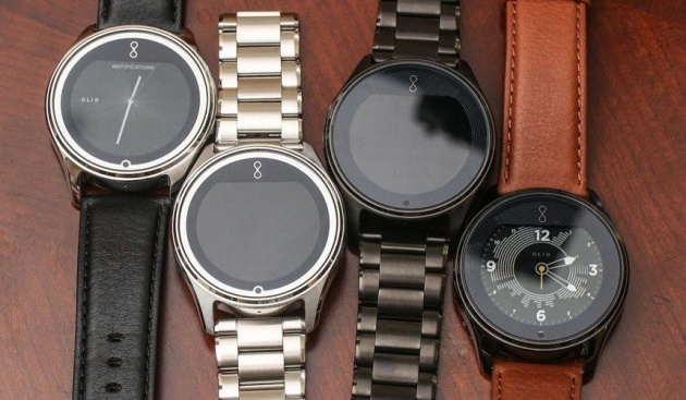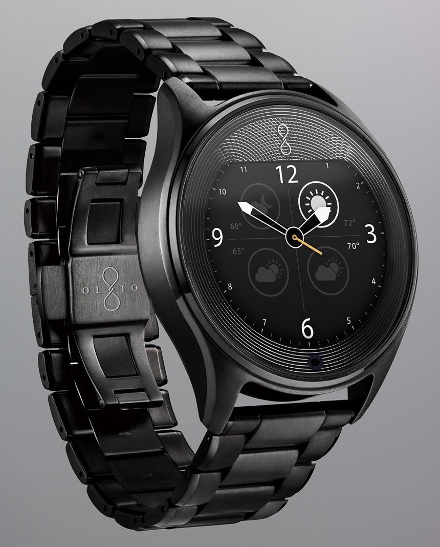
It’s not every day I’m impressed by a smartwatch. Plenty of Android Wear and Pebble devices have come and gone and aside from a brief “Huh” I haven’t really let any of them capture my attention. Olio is different.
The brainchild of former Apple and HP product designer Steven Jacobs, he wanted a watch that was rugged, usable, and easy to read. While he was aware of the competition, he used his hardware chops to put together something truly unique: a smartwatch design to combat immediate obsolescence.
Here’s what’s up: Olio has made a smartwatch with the same care and concern as the manufacturer of a mechanical watch. Gone are the cheap materials and chintzy bands and the attention to detail – from the beautifully polished bracelet to the unique interface – speaks more to a universality that is missing in Android Wear and an attention to detail missing in Pebble.
The UI is unique. Instead of an endless list of notifications a la Pebble, the Olio has a cloud-based system that only surfaces important messages as defined by the people you interact with the most. There are only a few screens available and the watch face itself displays the number of interactions per set interval of time using fanning lines of differing length. Longer lines mean you’ve received lots of notifications in that period and shorter lines means you’ve received less. Weather is front and center as are the timing tools, and to interact with any notification you answer “Yes,” “No,” or “Maybe.” Jacobs said he based this system on the memo system President Obama uses. The assistant will also, for example, see that you’re late for a meeting and offer to call you an Uber.


