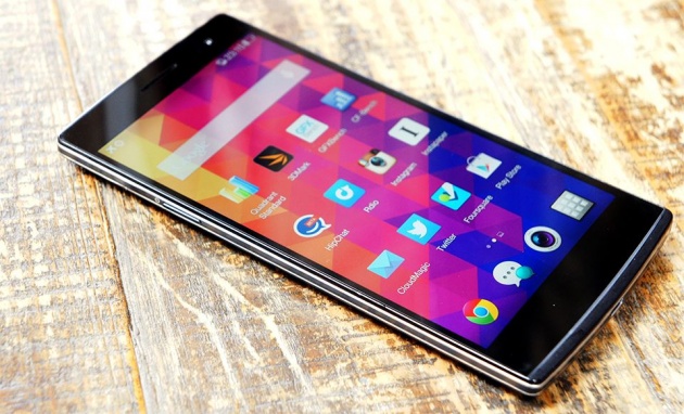
The Galaxy S5. The One M8. The G3. Every notable player in the overcrowded smartphone space has a flagship, one heroic device that the company pins its hopes on... for a year or so, anyway. For Oppo, a Chinese phone maker whose profile has swelled thanks to a surprisingly solid phone lineup, that flagship is the Find 7: an unassuming slab that looks painfully pedestrian compared to the last time the company went all out. Maybe that's a bit harsh. The Find 7 pairs top-notch performance with one of the highest-resolution screens you'll find on a mobile today -- hardly a formula to sneeze at. But is it worth the $599 asking price? Is Oppo really a mobile force to be reckoned with? Follow me, friends, and we'll figure it out together.
Find 7
PROS
- Plenty of horsepower
- Pretty good screen
- It charges really fast with the right gear
CONS
- ColorOS can take some getting used to
- Mediocre camera
- Safe, uninspired design
The Find 7 is Oppo's best phone to date, and that means something for a relatively unknown company that's already put out some solid phones. Its combination of strong performance and a Quad HD screen make it a worthy choice, so long as you don't mind learning a new flavor of Android.
HARDWARE
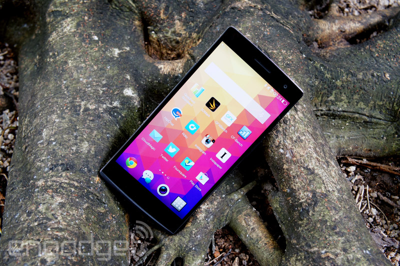
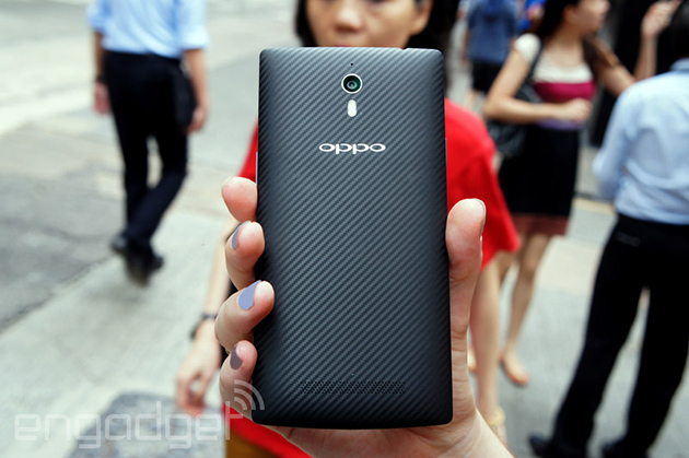
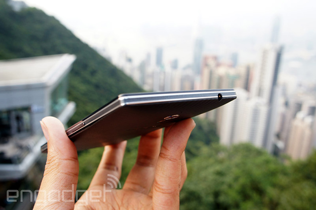
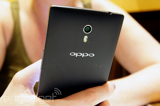
If Oppo's N1 pushed the boundaries of sensible smartphone design, then the Find 7 is a celebration of the slabby status quo. With its squared-off corners, flat sides and plain black face, the whole thing is almost unapologetically monolithic. The only real concession to the notions of grippability and comfort is the gently curving (and removable!) backplate. Ours was dark gray with an ersatz carbon fiber finish that squeaks when you run your nails across it, though there's a white model, too. If you really dislike the finish (and want to save a little money), there's a slightly lesser version of the device called the Find 7a that has pure, smooth backs.
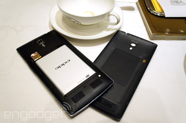
There's an Oppo logo etched under the 13-megapixel camera and dual LED flash. All that sits above the surprisingly solid speakers sitting low on the Find 7's rear cover. You're technically supposed to depress a tiny button embedded in the phone's edge to pop that cover off, but a little elbow grease (or, you know, some fingernails) will do in a pinch. Once you manage that little feat, you'll discover the 3,000mAh battery along with your bog-standard micro-SIM and microSD card slots. If you were to peer further still into the 7's chassis, you'd also spot the 2.5GHz quad-core Snapdragon 801 CPU, 3GB of RAM and Adreno 330 GPU that keep things running so smoothly (more on that later). Then again, you'd need X-ray vision for all that, and I like to think that if that were the case, you'd be using it for the greater good instead of reading this review. To each their own, I guess.
Things aren't much more exciting when you flip the 7 over, but that doesn't mean it's totally lacking in visual flair. There's not much to get excited about when that big 5.5-inch display is off, but there's a 5-megapixel camera situated nearby and a blue notification light (they call it the "Skyline Notification") pulses lazily when you've got a new message to peek at. Now if the light shining through the navigation keys below the screen wasn't so wimpy, Oppo might be onto something; it's damned near impossible to see under the harsh, summer sun... or any sun, for that matter.
There's a fine line between subtle and boring, and the Find 7 skews toward the latter end of that spectrum. Before you accuse me of being too harsh, know that there are some things worthy of praise. Take the overall construction of the device, for instance. Despite being crafted out of plastic, there's no give, no creaking, not even the slightest suggestion of physical inadequacy. Oppo may not be a name you run across too often, but there's little question that the company brought its A game when it came time to putting the Find 7 together. Factor in some pleasant heft and you've got a phone that feels a damn sight better than it looks.
DISPLAY AND SOUND
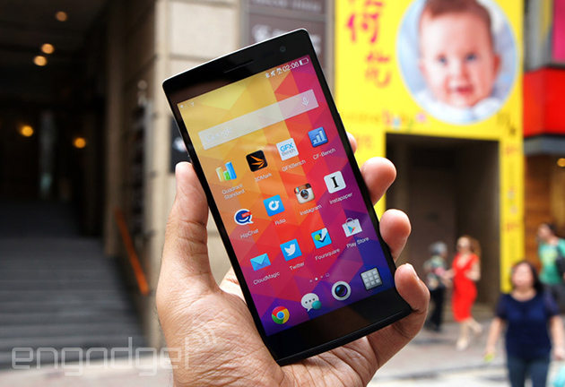
If there's one spec, one technical tidbit that makes the Find 7 such a desirable piece of kit, it would be that 5.5-inch Quad HD (2,560 x 1,440) IPS display. Oppo's design philosophy this time around seems to reflect that very fact -- the Find's face is so unassuming that there's nothing for your eyes to lock onto except for the screen. That's why it's a bummer to have to proffer this reality check: For all the commotion the Find 7's screen has caused in geekier corners of the web, it still has its share of flaws. Don't get me wrong: It's just as crisp as advertised, with individual pixels that are impossible to pick out with the naked eye, and viewing angles that'll make you popular with your airline seatmates. If all you care about is pure pixel density, the Find 7 won't leave you high and dry. But how about color reproduction? Erm, it's a little wonky: Whites tend to take on a cooler cast, which means every image is just a little bit off in terms of accuracy. Is it a dealbreaker? For a staggering majority of people out there, the answer's a definitive "no way." Most will just ooh and aah over the screen's crispness, and will never plop the Find 7 down next to another phone to see where those color differences lie.
What's a little more troubling is the Find 7's persistent trouble with brightness. You'd perhaps expect that a screen with so many pixels squeezed into it would fare well outdoors. You'd be wrong, mostly. Cranking brightness up to the maximum is almost always a necessity once you take the Find 7 out on the town, and even then it's not always enough to outshine the sun's harsh rays.
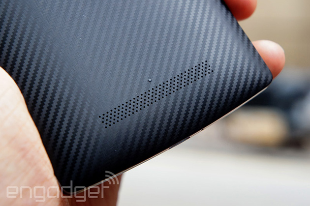
I don't expect much from most phone speakers. It's frustrating to see manufacturer after manufacturer cut corners and take shortcuts on a crucial part of the media experience, so you'll just have to imagine my surprise when the Find 7's rear speakers came to life in a big way. Yes, that's speakers, in the plural -- there's a single grille drilled into the 7's backplate, but it actually obscures a pair of speakers that renders audio with a clarity that's downright unusual for a smartphone.
That's not to say they're perfect. Mounting speakers on a device's back cover is an accepted practice, but it also means you'll occasionally shoot sound directly into your mitts. The other issue here, though, is one of depth... or the lack thereof. The Find 7's speakers get plenty loud for when you need to power all those mobile dance parties and what does come out is undeniably crisp. After a few moments of listening, however, you'll probably start to notice an absence of forcefulness in that sound, even in tracks that roll and thrum with energy. Par for the course for smartphone speakers? Sure, but it can still be a bummer.
SOFTWARE
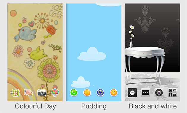
The Find 7 is physically pretty vanilla, but the software is anything but. At its core, it's Android 4.3 painted over in broad strokes with what Oppo calls ColorOS, one of the most extensively customized interfaces I've seen in a long time. No, wait, don't groan just yet. I'm about as big an Android purist as you'll find, but Oppo's approach -- while peculiar and extensive -- does bring lots to the table. Our own Richard Lai did a deep dive on ColorOS when he reviewed the more curious N1, but read on for a quick recap and my own take.
It all starts very subtly, with a lock screen that seems none too foreign -- one quick swipe and you're greeted by a familiar-looking home screen. That impression doesn't last for long. You see, the whole shebang is eminently skinnable; what you see out of the box almost certainly isn't how things will look after a few days. By my count, there are close to 150 various styles available for the Find 7 in the preloaded Themes app, with some obviously more up your alley than others. Oppo is far from the first OEM to embrace skinnable interfaces, but it adds plenty of appeal for folks who can't stand the notion of rocking the exact same thing as everyone else.
There's a camera interface that lives to the right of your home screens by default, too. It's a little kooky -- you're presented with a full-screen widget that shows you what the camera is pointing at, and tapping to snap a shot yields a photo with a Polaroid-esque white border. You can peck out little notes on those borders too, in case you just needed to complete the visual metaphor. Mildly neat? Sure. Particularly useful? Not quite. Oppo calls these more static screens "exclusive space" panels, but there are only two on board: the photo panel and one for music that displays a skeuomorphic turntable while you rock out. Thankfully, they're just as easy to dismiss as deleting an extra home screen.

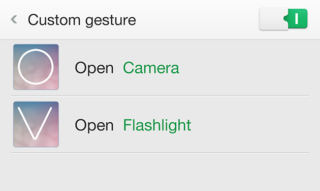
The notification bar is a two-parter: Swiping down from its right half reveals a lightly tweaked version of the classic Android notification shade. Swipe down from the left, however, and you'll be looking at a gesture panel that implores you to trace out a shortcut pattern or create one of your own. Only two gestures are ready for you out of the gate: You can trace a circle on the screen to invoke the camera, and drawing a "V" fires up the rear LED for use as a flashlight. The real magic happens when you move outside of that single panel. Try tracing a circle on the 7's screen while it's sleeping -- it'll instantly spring to life and bring up the camera interface. I'm not exaggerating when I tell you I fell in love with this seemingly simple feature; I've set mine to wake and unlock with a simple swipe up on a dark screen, kind of like on the HTC One M8. Alas, it's not quite as flexible as I hoped it would be -- you can connect certain actions like calling someone or recording audio to pre-made gestures, but you can't define your own pattern to be used on a sleeping screen.
And then there are the little touches, which I'm convinced make the biggest difference. Pressing and holding an app in the launcher causes them all to start wiggling in anticipation, and tapping the X in the corner prompts you to confirm its deletion. Should you accept, that's that; the app simply disappears from your life. It's a decidedly iOS-like touch, but it's not one I'm unhappy to see. Swype also came pre-installed on our test unit. I found myself installing Google's own stock implementation shortly after my first boot, but that's a purely personal choice -- the Swype keyboard has never been a slouch, and it's likely to be a welcome addition for some people.
So, would I choose ColorOS over stock Android or a less thoroughly skinned version of the OS? Absolutely not, but that's not to say what Oppo has cooked up is bad by any stretch. It occasionally feels overwrought, but it never feels overbearing. You get the impression that Oppo had the best intentions when crafting its user experience, even if you don't always agree with its decisions.
CAMERA
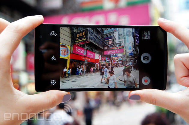
Say goodbye to the swiveling selfie camera of days past -- Oppo went with a more traditional camera setup this time around, which means the device lacks the kooky charm that made the N1 such a head-turner. As it turns out, the Find 7 actually uses the same 13-megapixel Sony Exmor sensor as the (much cheaper) OnePlus One, which means most of the imaging issues we've run into in the past are still present. I'd hardly call any of them dealbreakers: Soft focus will occasionally (and subtly) mar some of your more frenzied shots, and color saturation isn't quite as punchy as I'd like. In optimal conditions, you won't have to worry about these issues as much, but it's still disappointing to see an otherwise ambitious phone let down by a decidedly average camera.
While the primary sensor and the six-element lens aren't exactly unique to the Find 7, Oppo's nifty imaging app makes up for some of the camera's shortcomings. It's easily one of the cleaner camera interfaces I've come across: Separate shutter and video-recording buttons are nestled along the screen's right edge, and a simple settings grid can be invoked with a tap on the lower-left corner of the screen. Changing modes -- from slow shutter to GIF to panorama to HDR -- is handled by a separate menu that hovers near the shutter buttons, though you'll want to proceed carefully. Consider HDR mode, for instance: Photos tend to look a little too lurid even for me, so I've come to prefer the undersaturated results from Auto mode just a bit more.
And then there's the ballyhooed "Ultra-HD" feature, which essentially takes a series of 10 shots and stitches the four best together into a single 50-megapixel image. Sounds impressive, no? The whole thing works better than you'd expect since blurry or otherwise subpar photos get axed from the mix immediately, but the six- to seven-second delay means you're sometimes better off just snapping a few shots and calling it a day. Oh, and the Find 7 shoots 4K video too. As you might expect, the end product is always acceptable, but never outstanding, thanks to some autofocus wonkiness that usually forces you to tap on subjects manually if there's too much going on.
PERFORMANCE AND BATTERY LIFE
So far, the Find 7 seems like a mixed bag, with its lackluster looks and largely impressive display. Now here's the real question: What's it like to actually use? Surprise, surprise: As it turns out, a snappy processor paired with 3GB of RAM makes for a device that basically screams if you give it the chance. Put another way, you may not have heard of the Find 7 (or the company that made it), but it'll handle everything you throw at it during your daily grind and then some. There's no need to belabor the point too much considering it rocks a spec sheet that'll seem awfully familiar if you've fiddled with other recent flagships. Take a gander at the tale of the tape below to see how the Find 7 stacks up.
| OPPO FIND 7 | HTC ONE (M8) | LG G3 | |
|---|---|---|---|
| Quadrant 2.0 | 21,162 | 25,548 | 25,548 |
| Vellamo 2.0 | 2,963 | 1,804 | 1,405 |
| 3DMark IS Unlimited | 19,495 | 20,612 | 16,662 |
| SunSpider 1.0.2 (ms) | 751 | 782 | 918 |
| GFXBench 3.0 Manhattan Offscreen (fps) | 28.8 | 11.2 | N/A |
| CF-Bench | 35,872 | 40,223 | 24,667 |
| SunSpider: Lower scores are better; results compiled on Chrome. HTC One benchmarked on Android 4.4.2 | |||
The Find 7 is right up there with more of its big-name competitors, and pulls slightly ahead of the pack in certain areas. Of course, you can't stick a number to everything, and thankfully there were hardly any performance issues to note during my weeks of testing. I was afraid that Oppo's ambitiousness with ColorOS may have taken a toll on performance, but my fears were quickly assuaged. What few instances of lag I noticed seemed to crop up because I was swiping furiously among home screens -- we can probably chalk that up in part to ColorOS, but I suspect you'll rarely encounter that as you go about your day. The rest of my time spent with the Find 7 was filled with smooth scrolling and menu transitions, along with frenzied bouts of Asphalt 8, all of it stutter-free.
In our standard video-rundown test (looping video and WiFi on, but not connected), the Find 7 lasted for a solid 10 hours and 13 minutes before needing a top-up. That's a good hour less than what we saw with the Oppo N1 under the same conditions, but considering the size and resolution of the Find 7's screen, it's still impressive. Just be sure to keep the included VOOC charger handy. With it, the Find 7 goes from absolutely bone dry to fully charged in just over an hour. Most of that electrical magic happens pretty early on, too: Leaving the phone plugged in for 30 minutes should get you back up to around 70 percent. Alas, the Find 7's charger is bigger and more brickish than you might expect, so you may have to pack your go-bag carefully if you want that quick-charging power at your disposal.
THE COMPETITION
It's nearly impossible to look at the Find 7 and not draw a comparison to the LG G3. It is, after all, the only other smartphone on the market right now that features the same sort of super high-resolution display as the Find 7. The two phones may share a near-identical spec sheet, but LG has made some serious strides when it comes to a thoughtful user interface and industrial design that make it a much more attractive option than the Find 7. And that's to say nothing of the potential price differences, too: Just about every carrier in the US has committed to selling the G3, making it both easier to come by and easier on the wallet up front (as long as you don't mind a little long-term tomfoolery). In the event you're still not so keen on Quad HD screens, there's always the HTC One M8 and theSamsung Galaxy S5 to consider. They're the de rigueur recommendations for high-end smartphones, but that's because they're reliable and wot
| OPPO FIND 7 | OPPO FIND 7A | |
|---|---|---|
| Dimensions | 152.6 x 75 x 9.2 mm (6.01 x 2.95 x 0.36 inches) | 152.6 x 75 x 9.2 mm (6.01 x 2.95 x 0.36 inches) |
| Weight | 6.03 oz. (171g) | 6.00 oz. (170g) |
| Screen size | 5.5 inches | 5.5 inches |
| Screen resolution | 2,560 x 1,440 (534 ppi) | 1,920 x 1,080 (403 ppi) |
| Screen type | IPS LCD | IPS LCD |
| Battery | 3,000mAh (removable) | 2,800mAh (removable) |
| Internal storage | 32GB | 16GB |
| External storage | MicroSD (up to 128GB) | MicroSD (up to 128GB) |
| Rear camera | 13MP Sony Exmor RS, f/2.0 | 13MP Sony Exmor RS, f/2.0 |
| Front-facing cam | 5MP, f/2.0 | 5MP, f/2.0 |
| Video capture | 2160p (30 fps), 1080p (60 fps), 720p (120 fps) | 2160p (30 fps), 1080p (60 fps), 720p (120 fps) |
| NFC | Yes | Yes |
| Radios | Depends on the market | Depends on the market |
| Bluetooth | v4.0 | v4.0 |
| SoC | 2.5GHz quad-core Qualcomm Snapdragon 801; Adreno 330 GPU | 2.3GHz quad-core Qualcomm Snapdragon 801; Adreno 330 GPU |
| RAM | 3GB | 2GB |
| SIM slot | Micro-SIM | Micro-SIM |
| WiFi | 802.11a/b/g/n, WiFi Direct | 802.11a/b/g/n, WiFi Direct |
| Operating system |
Android 4.3, Color OS |
Android 4.3, Color OS |
Then again, if you're more a fan of the Find 7's Chinese underdog vibe, the OnePlus Onemight just be a better fit for you. Its screen isn't quite as pixel-dense as the one on the Find 7, but its internals produce the same amount of oomph (maybe even a little more, with less software cruft in the way). And, assuming you can even get your hands on one, you can have the OnePlus One for half the price of the Find 7. Alternatively, in the event that you really are more of an Oppo fan, there's always the Find 7's little brother: the Find 7a. For about $100 less, you get a nearly identical looking phone, albeit with a 1080p screen, a slightly slower CPU and 2GB of RAM instead of three.
WRAP-UP
I dig the Find 7. A lot, even. Despite a smattering of faults, it still stands tall as the company's finest mobile effort to date and Oppo die-hards shouldn't hesitate to pick one up. The tricky truth for everyone else is that the Find 7 doesn't live in a vacuum. There's no shortage of contemporaries like LG's G3 and the tantalizing OnePlus One that will make more sense because of carrier availability or cost -- although the latter is still admittedly tough to get your hands on.
Those are factors that Oppo can't control. What Oppo can do is make a solid device, and that's exactly what we've got here. Do you need an unlocked phone? With powerful specs, an impressive screen and a fast charging system? Can you appreciate a somewhat peculiar takes on the traditional Android experience? If you answered 'yes' to all of those questions, the Find 7 just might be worth the plunge.
Source: http://www.engadget.com/2014/07/24/oppo-find-7-review/


