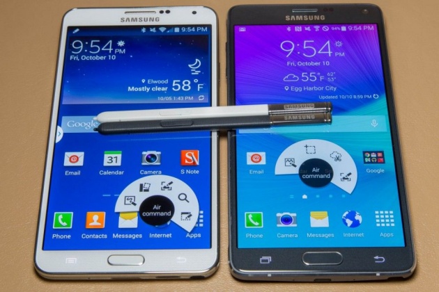
Above is a Gallery of the Note 4 and the Note 3, which turns into an expert-level game of spot-the-differences. Overall, the Note 4 is a little taller and heavier, the camera bump is bigger, and the Menu button was swapped out for a Recent Apps button. The speaker took a step in the wrong direction, moving from the bottom edge of the Note 3 to the back of the Note 4—farther away from the viewer's ears.
While the Note 3 has Micro USB 3.0, the Note 4 doesn't. It's been "downgraded" back to Micro USB 2.0. Surprisingly, Samsung should be commended for removing it. Micro USB 3.0 on the Note 3 was a clunky implementation that needed to be activated every time it was used, and it would auto-shutoff after four minutes. Somehow the faster USB port would interfere with the cellular modem—a disclaimer would pop up saying that calls and data would not work while Micro USB 3.0 was in use.
In Samsung's never-ending quest to be considered "innovative," the company frequently crams features into its devices with seemingly little regard for how well they work. With Micro USB 3.0, it's nice to see the company identify something that did little other than pad out the spec sheet. We wish Samsung would do this with more features that work poorly—for instance, the only borderline-functional heart rate monitor and fingerprint reader that it insists on forcing into its entire product line.


