As part of Le Havre’s design festival Une Saison Graphique which closed at the end of last month, the indefatigable Sarah Boris was invited to stage an exhibition of her work in the unlikeliest of venues, the town hall’s cavernous theatre. The French graphic designer we have come to admire through her work for some of Britain’s top art institutions, including the Barbican, Tate and art publisher Phaidon has won us over time and time again with an undeniably strong body of work that only continues to grow, and her site-specific installation Le Théâtre Graphique is one of her most ambitious projects to date.
Taking her venue into account, Sarah conceived of the exhibition as a three-act theatre of design that laid bare her process. The show consisted of a studio space where Sarah was based two to three days a week, with font specimens, paper samples, and reference magazines and books (including our very own Printed Pages and the 2014 It’s Nice That Annual) staging the various tools in daily design; an exhibition space showcasing a selection of ten years of work taken from two books Sarah collated and made for the exhibition; and lastly – to up the theatrical ante – what Sarah calls a design confessional where visitors were invited to reveal obsessions, doubts, queries, and mistakes on design and art in a real confessional booth.
“The exhibition was a real opportunity for me to take a step back and think about what my practice is and has been over the last years,” she says. “I also had to bear in mind that a lot of people in France aren’t necessarily familiar with my work or the institutions I have worked for in the UK, so the exhibition helped visitors navigate through my process.”
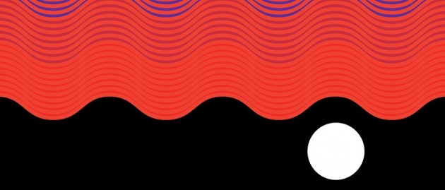
Alongside the exhibition, Sarah created a sunny, four-colour screenprinted poster advertising the festival to be plastered around Le Havre, designed to be what she calls a pied de nez to the industrial seaside town which is often described as grey and rainy. She cleverly turned this homage to the city into a second poster advertising her exhibition, reworking the sun and waves into another design featuring metallic silver and fluorescent red ink, and has since translated both into a limited edition artist book. “The second poster was inspired by the first,” she says of the design that continues to play with the idea of the theatre space. “I was doing colour tests and realised that the waves really looked like a curtain in red and when flipped around.”
Her designs are unapologetic in their simplicity and are all the stronger for it. The yolk-yellow sun and soft blue waves of one and the gunmetal grey and fluro red closing curtain of the other are the perfect bookends to what looks like the first of many such well-thought out and impressive one-woman shows to come from Sarah.


