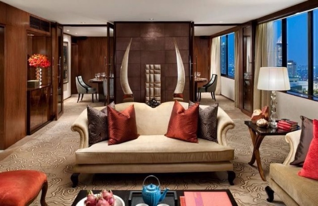
You can not think of designing a hotel in the countryside, in the mountains, the sea, in a country, in a city or in a large urban center doing the same assessments. The location and its surroundings have their weight on the hips interior design choices.
Today I would like to talk about the concept of the interior of a hotel intended for a big city and for which you should do even a distinction because the project still has a big different application if we think of a leisure hotel or any business, although now the permaneza average of a client in holiday is little different from that of a business customer. The difference lies not in the room but in public spaces, in their budget and services.

This business hotel is dedicated to customers in a large metropolitan city must be designed with an extreme simplicity, clean lines, but with a taste and an atmosphere that does not render it at once too simple and poor. In this project, the room is designed to create an elegant and stylish environment without that it is placed too strong accents on the elements that characterize it, so that each one assumes their value and its meaning to give logic to the whole.
The read head element has been thought of as a set of padded panels arranged horizontally, one above the other up to the ceiling and each of which has a different height dimension, with the idea to resume the concept of large blocks of stone drafts that characterize the buildings surrounding the twentieth century.
The area dedicated to the wardrobe and the desk is made with simple items per day made by planes in hollow with an ebony veneer reassembled and that allow you to have an open space and views that do not appesantisco or close too the environment of the room it is the bare minimum of 14 square meters prescribed by the regulations; between the two groups of furniture you are located in the sliding door leading to the bath and that has a finish in the same essence, as well as that input to the chamber, and which are equipped with above door panels and trims that lead up to the ceiling for call up the head of the bed game.
The environment is therefore essentially generated and characterized by horizontal and vertical elements that intersect in volumes and surfaces that damage the environment tone then find himself in their color shades and being grouped and highlighted by the coloration of the walls that runs on the inner sides 3, or parts of them, leaving instead the blank to the outer wall and part of the internal ones so that the light entering from the two windows can be amplified and balance the absorption of dark tones of the rest of the room and the floor.
The rigidity of these elements are found the softness of the rich striped curtain, always in the same tones of the other elements and that emphasizes the verticality, upholstered bed and enriched textile packaging, the armchair and bedside lamps; elegant design elements that become perfectly integrated foreign bodies.
The environment bathroom is long and narrow and sees as one enters the focus in the furniture dedicated to the containment of the basin so that even if the door should remain open, from the room you would not see the health area and the prospect would not be unpleasant. This part of the interior is also very simple and characterized by the same logic of the rest of the furniture, with horizontal and vertical elements veneered and sees also integrated towel holder, to break the rigidity of the lines we find the round mirror with integrated LED light and the oval ceramic basin.
In this area there are large functional surfaces both on the basin plan on the shelf or on the ottoman. The health dedicated area is located immediately to the left on the side towards the window and the shower area instead of on the opposite side and which extends for the whole width of the bath, giving rise to a very comfortable space and appreciated by those all day turns stressed about work.
The coating and the bathroom floor are also very rigid elements and facts from large slabs of porcelain tile format split stone effect, chosen to also draw the coverings of the facades of the surrounding buildings that characterize the urban landscape, only in shower area rigidity is interrupted using a tile with three-dimensional material effect to accentuate the importance of this functional area.
This is a project that is full of details, details and atmospheres that allow you to create an attractive room and above all functional both for the guest and for the staff, add value not just to achieve the required target.


