Colours contains three properties, these are Hue, Saturation and Brightness
Hue
Colours are called hue. Colour is seen as Red, Yellow, Blue, Green, Orange etc
You have Primary and secondary hues
Primary Hue
There are two types of primary colours.
- The traditional light, known as painters primaries, which are Red, Yellow and Blue (RYB)
The other set of primaries are Red, Green and Blue (RGB) these are transmitted light which create colour on your monitor or digital camera.
Secondary Hues
Each primary color has a color contrasting it these are also called complementary colours.
- These are Green(Complementary to red), Violet(Complementary to Yellow) and Orange(complementary to Blue).
- combining these colours together in a photo may create harmony or tension, Red and Green together creates complementary harmony.
Saturation
Also called Chroma it defines a hue’s strength of fullness
- Fully saturated Red is a pure Red, this means it is not diluted or reduced.
- Hues that are less saturated look grey or “dirty”. This is disaturated which is a result of mixing white or gray with a hue.
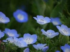
- Photographers favor pure hues, for example - A bright blue flower in the muddy greenery creates impact. This is also a pure who as there is no white or grey making it look “dirty”, this is done by having a pure hue, exposure and focus.
Brightness
- Defines hue as light of dark
- It differs greatly between hues
- Yellow has a short range, from mid-tones to bright. But it don't exist bellow mid-tones as it becomes Ochre colored.
- Blue contains the whole range, from deep dark to very Bright.
- Green has a big range but not as big as blue.
You cannot go above/ bellow the spectrum of the colour range, depending on what colour it is, this is because it will not look right it wont be the true Hue.
Advancing and receding colours
- Some colours like red or yellow appear to advance towards you, Where as blue or green are more receding.
- Having a red foreground element will add to the feeling of depth in a photo.
For example:-
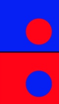
- This looks like a red ball in front of a blue wall as this is how our eyes see it.
- But having the colours around the other way looks like a red wall with a hole in it revealing the blue background.
Yellow is not equally extreme in this case, It depends more on the background. Yellow would be more advancing on a black background than a white background. This would be because Yellow and White are quite the same.
Combining Colours
How to/ or not to combined colours is not an easy answer.
- Sometimes the best thing to do it break the rules and not always stick to them because it depends on what you are trying to achieve.
- There is no clear rules but if you want to create a visually pleasing image then look at them.
- Complementary harmony occurs when any colours is combined with the opposite to it on the color spectrum.
- E.g- Red and Green
- And there is analogous harmony which are combination os colours that lie next to each other on the colours spectrum. E.g- Yellow-Green, Yellow and Yellow orange.
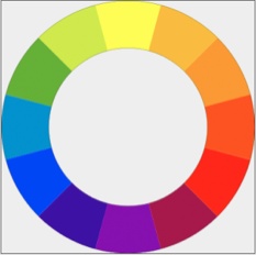
When combining colours you also need to pay attention to each colours intensity. This Intensity scale is still used today.
Yellow- 9
Orange- 8
Red- 6
Green- 6
blue- 4
Violet- 3
The Intensity means a great amount as the higher the intensity the colours, the more dominating. E.g- Yellow is 50% more intense than Red so Red will be the dominant when combined. The Photo bellow has done this, making the red dominant colour. It hasn't been done spot on to the intensity rule(the blue) but it has been thought about and after all there is other components the think about. Such as Hue, Saturation, Brightness etc.
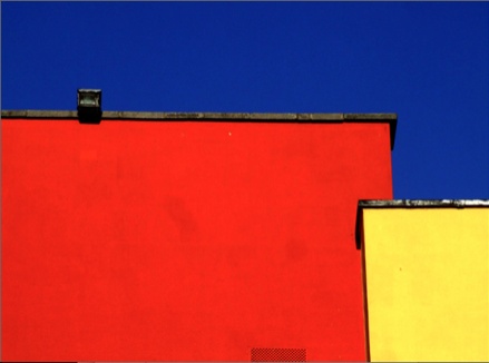
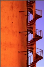
In this photo there is perfect Complementary harmony. Orange and Blue are complementary colours on the colour spectrum. which is why this photo is so perfect.
Liam Dickins - Film Maker & Producer


