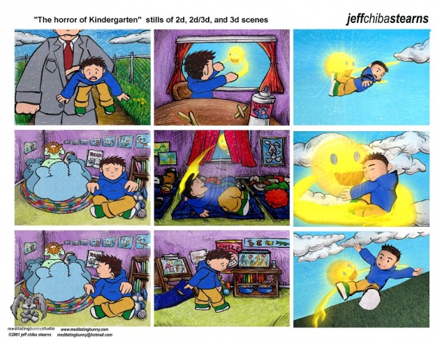
While I was going through some old files on my computer, I found some old concept art from my 2001 animated short film, The Horror of Kindergarten. The development of a film is a fun creative process so I thought I would share some of these drawings here on Bitlanders to help illustrate some of the pre-production material I needed to help create a short animation.
The Horror of Kindergarten was my animation program graduation film when I was attending the Emily Carr Institute of Art and Design. The film took 9 months to create from pre-production, production, and post-production. The pre-production took almost 4 months to pre-visualize what the characters and overall look and feel of the film should be. For the film I decided to use a thick brush ink line to outline the characters and then fill them in with colour using a crayon textures applied in Photoshop. As well, it took time to create the storyboards and write the script. The film is based loosely on Joseph Conrad's novella, The Heart of Darkeness...but set in a Kindergarten classroom!
Here is the synopsis for the film:
The Horror of Kindergarten is a whimsical collage of a little boy’s first day of Kindergarten. The 2D/3D animated film revolves around the philosophical Conrad who tells of his experiences as he journeys into Kindergarten’s heart of darkness all while knowing of the impending horror that lay ahead. Frightened by his strange surroundings, Conrad finds refuge in his imagination.
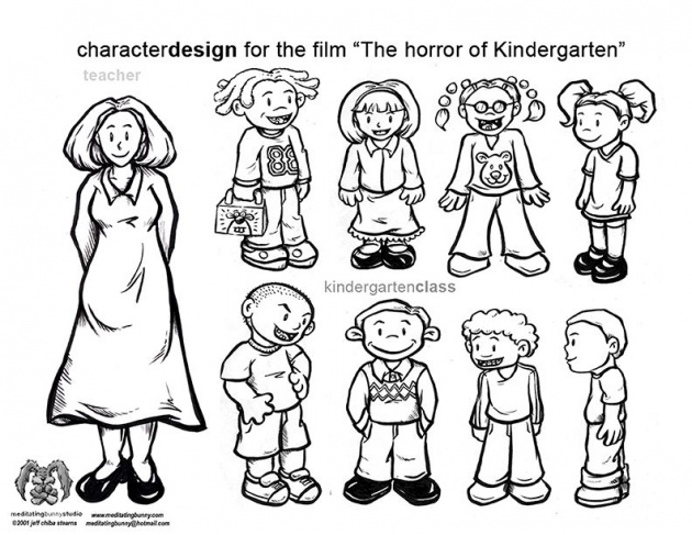
Here's a character design model sheet of the kids in the kindergarten classroom.
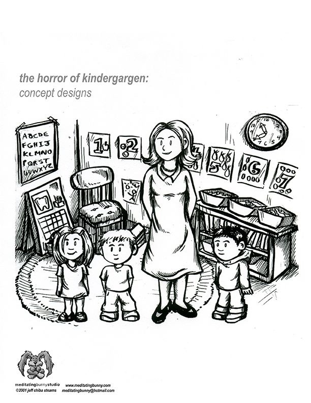
Below is an early drawing of the kids composited into the kindergarten classroom.
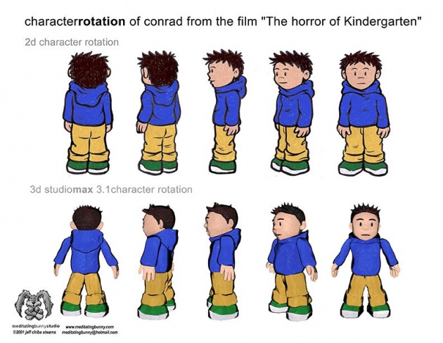
Here is a character rotation model sheet of the main character Conrad in both 2d drawing and 3d CGI. I use this sheet as a guide when animating to make sure I always drew Conrad the right way in each scene.
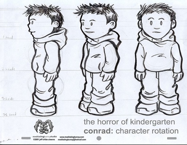
Here's an early rotation model sheet of Conrad to show how many heads tall he is. Since he was a kindergarten student around 5 years old he has a larger head to body ratio. Conrad is about 3 and a half heads tall. It's important to keep this consistency throughout the film so the character looks the same every time I drew him!
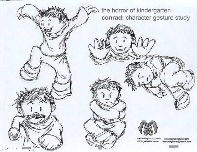
Here is a very early sketchy gesture study/action sheet of Conrad. This helps show his emotions and expressions as a character through rough and quick drawings.
It's been over 13 years since I finished the film. I find it hard to watch the film now that it's been so many years. When I watch the film now, I always see things that I want change to make the film better. Although, progression of an artist is very important. It's good to let the original art speak for itself and grow as an artist with all new work!
Please BUZZ and SUBSCRIBE for more updates on artwork, blogs, and videos! Here's the original 2001 film, The Horror of Kindergarten!


