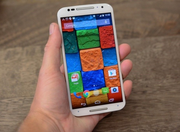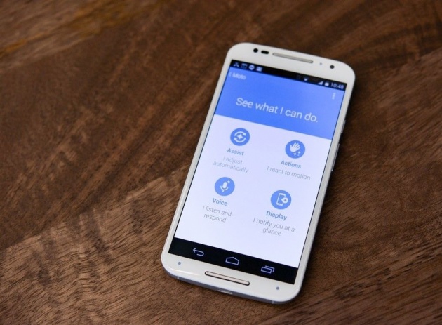
Today, Motorola announced its second-generation Moto X, the successor to the company’s rebooted flagship smartphone that was unveiled just over a year ago. Yes, the phone will simply be called Moto X again — not X+1, as some rumors had suggested — and it’ll be available for the same $499 unlocked as the original when it launches later in September (that’s for 16GB; the 32GB version runs at a $50 premium). AT&T, among others, will be offering it starting at $99 on contract.
I’ve had a chance to spend some time with the new X this week, and something strange happened: I fell in love with it the moment I first held it.
I say that’s strange because we’ve reached a point where even mediocre smartphones are pretty wonderful. They just aren’t getting better in simple, obvious ways that normal humans can understand with the same relentless velocity that they used to. The mind-blowing outliers — the phones that make you instantly relieve yourself of several hundred dollars without a second thought — are becoming scarce and far between. Basically, it’s hard to fall in love with a phone when every phone is lovable.
And Motorola certainly needs a love-at-first-touch reaction: the first-generation Moto X, as terrific as it was, failed to make much of a dent in developed markets. (When the 75 million unit-per-quarter Samsung machine is the market you’re trying to dent, the challenge looms undeniably large.)
So what makes this phone so great? For starters, it looks really good. Under design guru Jim Wicks, Motorola’s attention to detail is rivaled in the smartphone industry only by HTC and Apple. The original Moto X’s magic trick was that it felt pretty small for its generous 4.7-inch display, and the new one pulls the same sleight of hand — but it does it with a 5.2-inch screen, a size that’s more in line with 2014 expectations. Much of that magic stems from Motorola’s now-trademark curved back, which leaves ample room for guts (battery, circuitry, so on) in the center but slopes to nearly nothing toward the left and right edges.
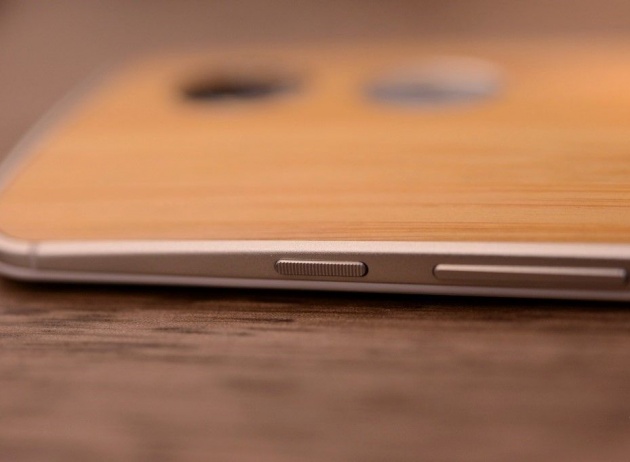
Speaking of the edges, they’re now made of metal, which is a huge deal. Some phones earn their “premium” stripes with fake metal; others use the real thing, but the first Moto X didn’t use any sort of metallic decoration at all, which hurt its image as a flagship device. The new X fixes that: the curved metal rim looks and feels fantastic. Engineering boss Iqbal Arshad is keen to note that the rim acts as an antenna, and the phone actively tracks how you’re holding it in order to adjust RF performance in real time. In other words: he promises Apple’s long-forgotten reception problems on the iPhone 4 won’t crop back up here.

The display, a 5.2-inch Super AMOLED that Arshad says is considerably more power efficient than last year’s SAMOLEDs, delivers true 1080p resolution. I still don’t really believe that 1080p makes a noticeable difference to the average phone user, but the original X shipped with 720p at a particularly bad time: all of its primary competitors had just stepped up to 1080p. Sometimes, you just have to check the box so you can say “our number is as big as theirs,” and that certainly seems to be the case with screen resolution — particularly in the spec-hungry American market. It was an important gap for Motorola to close, and now it’s closed.

Carrier stores will be stocking more than just the plain black and white configurations in stores, which could help bridge the gap between the impulse buyers who want a phone on the spot and those who want a really good-looking X that still feels “customized.”
By the time the refreshed Moto X is in carrier stores and on Moto Maker later this month, it’ll be going up against an all-new Apple threat — but this might just be the strongest competitor Android has ever put up. Game on.


