When I was a young lad and had all my own teeth – as opposed to someone else’s teeth which is a very odd acquisition – I used to collect film posters. Every Saturday night, I forewent ‘Jim’ll Fix it’ (who’s laughing now) to visit cinemas in South and East London to collect quads and lobby displays that were discarded by cinema staff. That’s right, back in the 1970s and early 1980s, film programmes changed on a Sunday. In fact, in South London, we would get films one week later than North London and even later still than the West End. The cinemas that were most generous included Odeon cinemas in Elephant and Castle, Lewisham and East Ham, as well as ABC cinemas in Catford and Streatham. Cinema managers did tire of my presence, even in my short trousers (my mother couldn’t afford new ones; my Ancient Greek moniker would be ‘barer of socks’). So I had to mix it up a bit. Plus some of these places are quite scary at Nine O’Clock at night. We didn’t have mobile phones in those days – just two cans and a piece of string. Why anyone would carry two cans and a piece of string in the years before recycling is a mystery.
But in my poster collecting days, I acquired upwards of two hundred. They were of course advertising films of the late 1970s and early 1980s, so of extremely variable quality. I’m proud to say I have an original ‘Moonraker’, though if I had the actual flying vehicle I might not have had to take the bus to school. What poster collecting taught me was the seductive allure of simplicity. The posters that looked the best often reduced the movie to a few essential elements – a pumpkin with teeth, for example, or a man in a hat and coat outside a house, illuminated by a street lamp.
Why is this relevant? Because the Strand Gallery in London is hosting an exhibition of contemporary film posters advertising forthcoming releases such as ‘The Accountant’, ‘Hunt for the Wilderpeople’ and ‘Bridget Jones’ Plastic Surgery’. All right, maybe not the last one, but you get the idea.
With this in mind, I wanted to nominate my top ten favourite film posters from my collection. Each one meets the creative brief: less is more.
10. After Hours (1985)
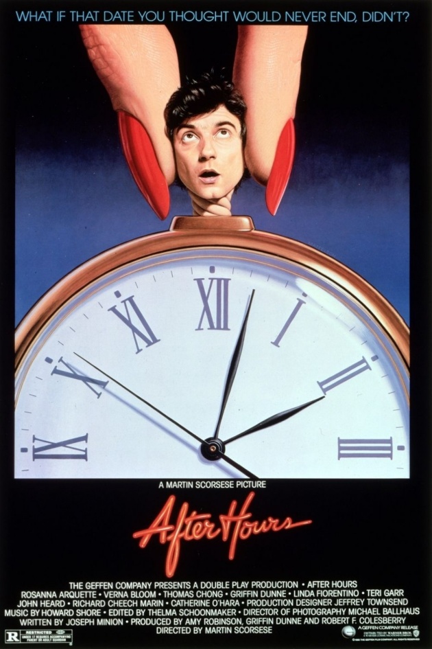
Three minutes past two in the morning and Griffin Dunne (aka Paul Hackett) is having his head turned by two manicured fingers; the title is written in fluorescent tubing. The film is brilliantly suggested – it’s a comedy about desire and time. It gives nothing of the plot away. Tagline: what if that date you thought you’d never end didn’t? OK, it’s misleading. Paul starts trying to date one woman (Rosanna Arquette) but meets several others on the way (Linda Fiorentino, Teri Garr, Verna Bloom). Throw in some zippy camera effects and you have director Marin Scorsese showing he can do more than the intense stuff. Nowadays, it’s: remember the intense stuff?
9. Invasion of the Body Snatchers (1978)
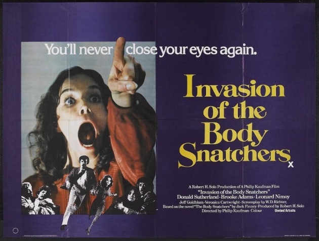
The British poster has Brooke Adams with her mouth wide open with little inserts of Donald Sutherland with a beard. Old style film posters didn’t have to show the entire cast, but did suggest a series of movie stills. Admittedly the design is caught between two ideas, but in my mind’s eye, it’s just Brooke Adams
8. Superman (1978)
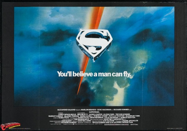
The ‘Superman’ ‘S’ logo in the clouds and the streak of light made you wonder how the filmmakers could make you believe a man could fly? And what did Christopher Reeve look like in the costume. The suggestion is everything.
7. Zelig (1983)
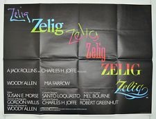
The film’s title written in various different fonts – we had no idea what the film was about or what Woody Allen looked like as Zelig. But as a design it is brilliantly simple.
6. Moscow on the Hudson (1984)
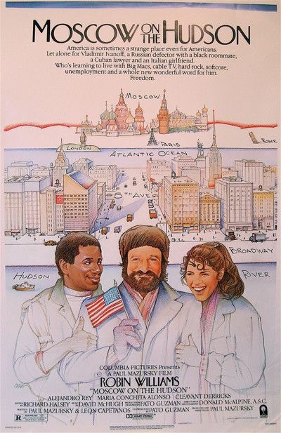
A pastiche of a ‘New Yorker’ magazine cover, this poster suggests more than an average Robin Williams comedy. It suggests sophistication as opposed to ‘I defect’ ‘Well, go and use the bathroom’.
5. Stardust Memories (1980)
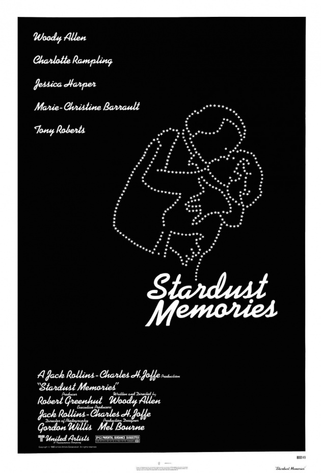
Another suggestive poster in which there is no need to show the star – we know what he looks like. A couple kiss – who doesn’t forget a deep and meaningful kiss, especially whilst eating a mint imperial? Only choking...
4. Poltergeist (1982)
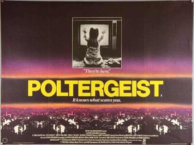
What’s inside the TV? Why is the girl interested? Less is more. This is where Benedict Cumberbatch got his idea to turn away from the viewer.
3. ET – The Extra Terrestrial (1982)
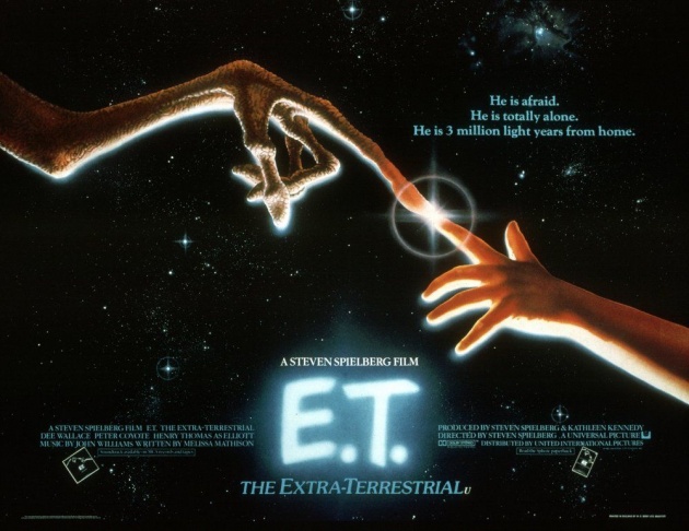
The design rips off Michelangelo, but it withholds our view of the alien, exciting our curiosity. You have to make people want to enter the cinema. Not sure about the tagline.
2. Alien (1979)
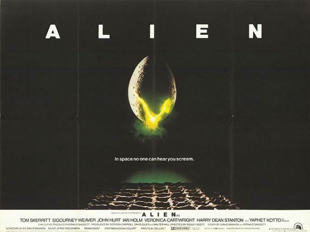
Egg in space cracking menacingly above an unusual terrain – simple! In space, sound doesn’t travel – it’s a vacuum. Now what's that about the bonus situation?
1. Star Wars (1977)
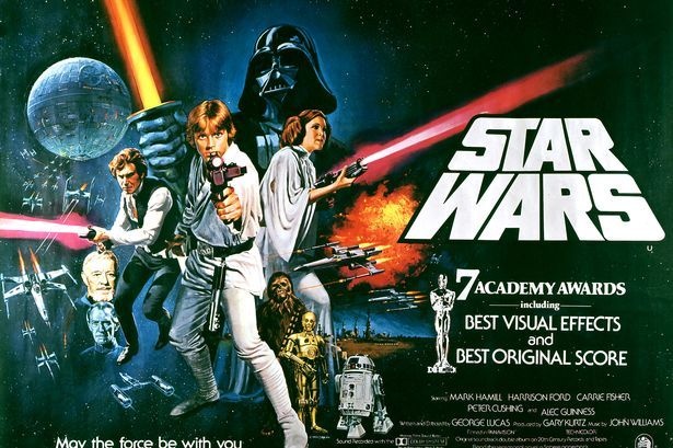
I’m pretty sure my one doesn’t have ‘7 Academy Awards’ but the second poster (not the original) made the characters clearer and the film more immediate. This is the poster that for me started it all...
The State of the Art Cinema exhibition continues at the Strand Gallery, John Adam Street, London, until Thursday 18 August 2016 – admission free


