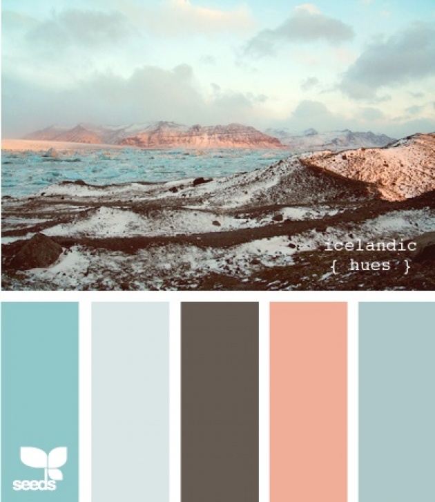
As I spoke about in my last blog, i've been looking a lot into branding recently. And something that I've really been focusing on is the power of colour. And colour is something that we touch upon every single moment of every day of our lives.
When we're decorating our houses, picking a car, choosing an outfit, even choosing a phone wallpaper... colour plays a role in every, single, decision. And the psychology behind the decisions is extremely interesting. Just take a look at this chart:

Colours like red are used to increase appetite, when colours like blue are supposed to be good for concentration, and therefore useful for companies to use to look serious and hard working. If you look for it you can see these patterns everywhere... mc donalds using red, along with Pizza hut, KFC and Burger King! Blue on the other hand does seem to be used for the more serious companies such as at&t.
Even in films, there are colour palettes used throughout. As you can see below from the movie barcode, limitless uses the colour green very often! :

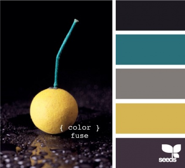
However, often finding the right colours to complement one another can be the hardest thing of all. Thats why I've been using this website http://design-seeds.com to help me with my palettes!
Its a great website for finding a particular shade you love, and matching it up with others. Such as the examples below:
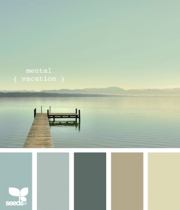
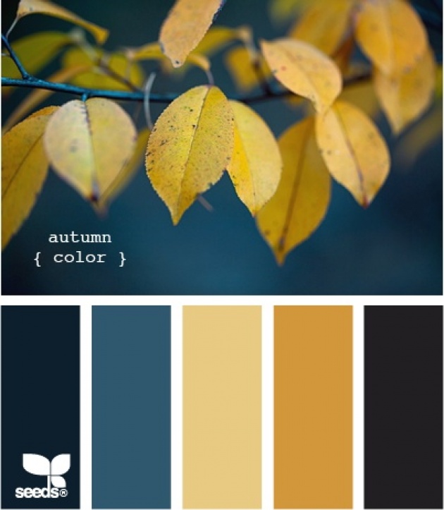
I love the way these colours work together, and I love the way theres an image of all the colours matching one another, but each individual colour also for reference. I'm so happy I came across this site for the future! It will be usefu for not only branding, but also films, decorating, and everything I do!
