In the last post, I described how I went about planning a character animation shot. I described the process of shooting reference videos and using sketches. In this post, I'll detail the process of using the sketches to bring the character to life!
In this film, I utilised a technique called pose-to-pose animation. This is animating from one pose to the next and using the animation software to do all the in-between animations for you. If you're interested in learning about it, this site teaches a lot. The other method is called 'Straight Ahead' Animation and this is basically stepping one by one in the timeline and posing and keying body parts to create movement. In this film, I did use the straight ahead technique at times but I mainly stuck to pose-to-pose as it was more convenient for me to get the timing right.
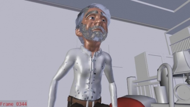
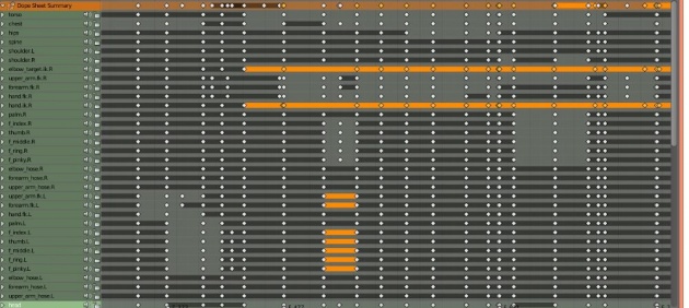
Using the sketch animation, I then blocked out the the animation based on each image in the sketch. At this point, I was feeling really excited to finally work with my character! The blocking stage was quite simple. I would go through each sketch image, pose the character to look like the sketch image and set a keyframe. This way the keyframes are well organised on the timeline. Having organised keyframes allows me flexibility and freedom to modify the timing and pose of the character and fix them easily without having to find each keyframe (for example, the hand) and modify them individually. This is something I've learned from reading Keith Lango's blog. Here is the article that teaches realistic character animation which can also be applied to Blender: http://www.keithlango.com/tutorials/...u/popThru.html. I've learned a whole lot just by applying his principles.

At this point, I had a decent looking animation but it did look flat, dull and robotic. This is one of the disadvantages of having very organised keyframes, the result almost always looks boring. But this was only a first pass just to see if the timing and poses was good. Here is the first pass of blocking out the sketches:
Before I went in and messed up keyframes, I asked for feedback on the BlenderArtists forums from other Blender users what they thought of my animation. They gave me helpful feedback which I believe has helped me get the best looking results possible compared to working alone and delivering a half-done job. It's always useful to have another pair of eyes look at your work from a fresh perspective as they can pinpoint issues that you would never have found yourself. In the second pass, I added camera movement, given him some facial expressions, and fixed issues such as the sliding feet when he is walking, and his balance as he gets up:
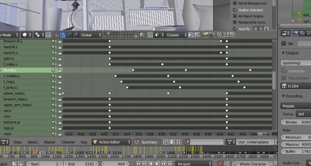
For the third pass, I finally get my hands dirty and start messing up the keyframes and disorganise everything to remove the robotic and dull movements and instead introduce spontaneous and organic movement. This is done by shifting the organised keyframes. For instance, I would move the lower forearm keyframe a frame later than the upperforearm so that they don't land in the same pose at the same time. It sort of looks like a "chain" effect and hence more organic and smooth. I never really touched the f-curves since I never really felt I needed to. Maybe I need a bit more experience to understand f-curves...

So here is the final polished and (hopefully) more organic-looking character animation of Mr. Uyir:
So that's basically it! It is a time-consuming and depending on how complex your movements are, quite tedious as well. For instance, fighting scenes need a WHOLE lot more time to be spent on then my simple scene shown above. This is due to the amount of poses needed as well as the interaction between characters as they clash (which also affect timing!). The next scene in the film is a fighting scene and I'll post a blog on the making of that quite soon!
Subscribe to follow updates on this project, and if you're not registered on BitLanders, register here!Website: uyirthefilm.weebly.com
BA blog: blenderartists.org/forum/showthread.php?343742-Uyir-Short-Film-WIP


