Now that I'm happy with the pre-production phase, it's time to move on to the production phase, finally! In this post, I'll be detailing the making of the film's main character, the old man. This will be the first time I'll be creating my own character for a film. No more cheating, and now I can have a character to call my own. I've seen many online tutorials on ways to go about doing this, and I now feel I have some idea of how to go about doing this, which I'll be sharing over the next few posts. I used the free open-source software Blender to make my character since I'll also be using Blender to make the film. However, I intend to make these posts generic enough so that these skills can be applied in your own 3D software. Power to the artist, not the tools! Hopefully, this will help anyone looking to build a solid, detailed character for a film. I don't intend to completely show how it's done as that will span an entire textbook, but I mainly aim to show the process.
One of the first things I did was to load in my concept images of my character as a background image in Blender. The process would be far smoother if you have accurate front, and side views of the character. This is also what the bigger guys do, like the makers of Shrek and Toy Story. And they have reference images of the characters from a number of different angles. For me, I only had a front view drawing, and pretty much just guessed his side view.
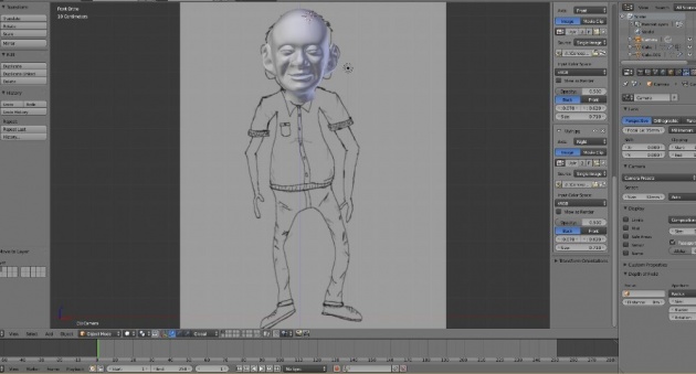
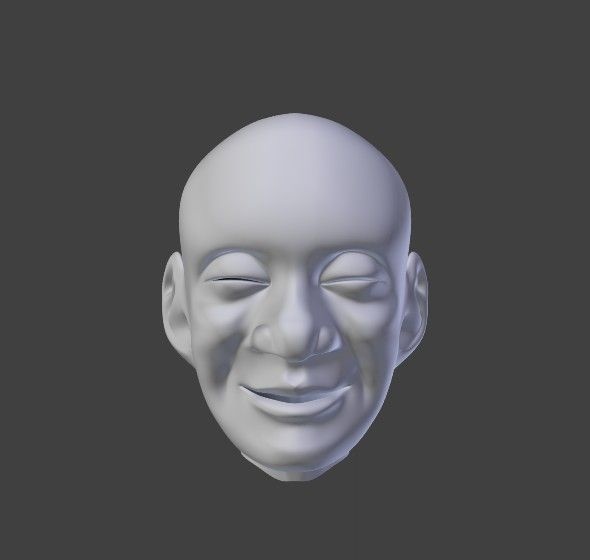
Using the reference images, I then started to model his head. There are plenty of tutorials on the web about how to go about doing this. The most important thing is making sure that edge loops flow around the eyes and the mouth. Here is the result of my head modelling:
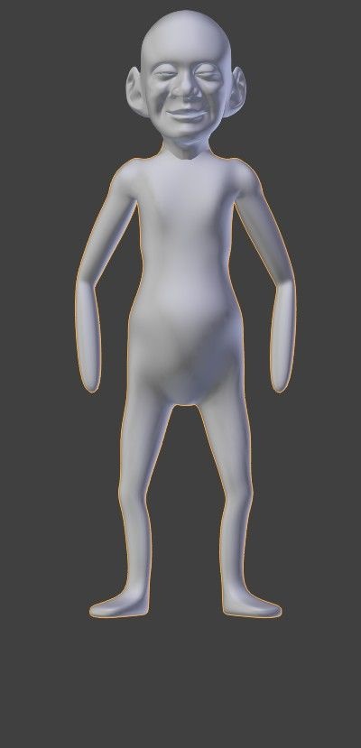
After this, I would rough out his body proportions, again making use of the reference images. I used Blender's Skin Modifier to quickly carve out his body proportions. Sculpting out his body from a cube or simply box modelling would have also worked well, but I chose this method as it was much quicker and allowed me to experiment with his body proportions. The Skin Modifier allows you to quickly define a skeleton and uses the skeleton to define a skinned surface. You can then quickly adjust scaling and proportion of each joint of the skeleton to get a surface you're happy with. After making many adjustments, I settled with this clunky result below:
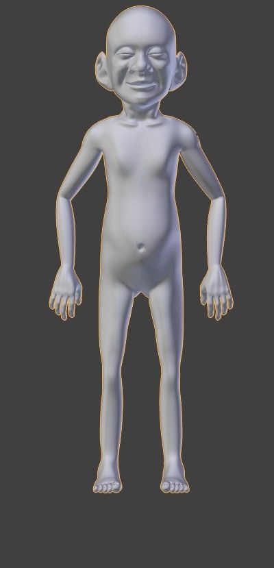
One drawback of the Skin Modifier is that it leaves a very bad topology making it nearly impossible to animate with. This is where I had to re-topologise the body but now I have a better reference than relying on the images. Blender has a feature which allows to snap vertices to an object. This allowed me to concentrate only on edge loops and flow and making the body suitable for animation without having to worry whether I made his arms too small or his legs too skinny. This has already been roughed out with the skinning. Below is the result of the retopology. I made some tweaks here and there to make it better and to address the clunkiness of the skin modifier. For instance I added in collar bones, defined his neck shape and defined his muscles throughout his body a little better. I would then go in and box model hands and feet and join them to the rest of the body. Finally, I would take on the complex task of joining the head to the body. It's important that when connecting the body to the head, that the number of connecting vertices on the head match the number of connecting vertices on the body. This way, merging the head to the body will be far smoother. In my case..it wasn't..I had to delete edge loops here and there (which sacrificed detail), in order to make sure the number of vertices matched.
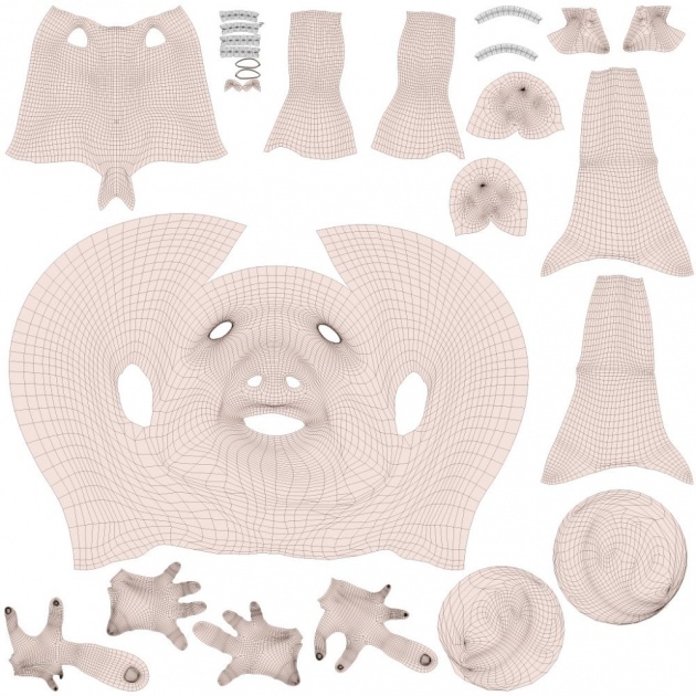
Once I was happy with the body modelling, I went ahead and created a UV map for him. The UV maps will be mainly used to texture him, but I chose to do the UV unwrapping early as I wanted to generate bump maps for his pores and wrinkles and a UV map was required for this.
To sculpt out the fine details in his face, I duplicated the old man's mesh and deleted everything but the head. I didn't worry about detailing the other parts of the body as this will be mostly covered by clothing. I then spent hours (using my trusty Wacom Bamboo Pen and Touch Tablet) to sculpt pores and fine wrinkles. You can use a tool such as ZBrush to do this as this tool is known to allow you to create a crazy amount of detail. And I mean really crazy (somewhere in the millions to tens of millions of polygons). One can simply search for 'ZBrush' in Google images to see the amount of detail I'm referring to. I would subdivide the head a couple of times, and used a crease brush to draw in wrinkles. His deep wrinkles would be visible in the side of the cheeks, under his eyes, the neck and on his forehead. I would then go in and add pores. This was controlled by textures. I had to also subdivide the mesh a few more times. I would very faintly sculpt in pore textures throughout the face which would help give the realistic appearance of human skin instead of a plastic doll-look that you may be familiar to seeing in CG.
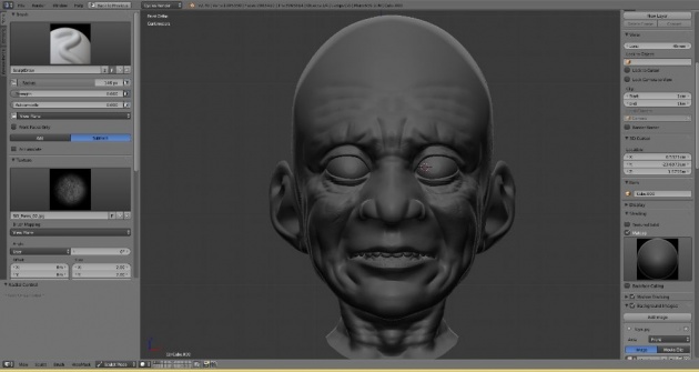
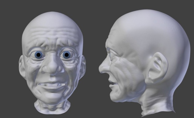
The old age is finally starting to show in the sculpt. That's a great sign and makes me feel like I'm on track! My final sculpt nearly reached 2 million polygons! No way is this going to be possible for animation. I mean, it could, if you have an extremely powerful supercomputer but it really isn't ideal. I also intend to give away this model for free to general users so I needed to make this efficient as possible. This is where the UV mapping came in handy. I could bake a normal map for him which would allow me to use the low poly body mesh which was already modelled for animation. A normal map allows you to fake the idea of bump in your mesh. For instance you could have a plain square mesh to represent a wall. By adding a normal map of a brick texture for example, you can fake the bump of a brick and hence make it look like a brick wall. This is far more efficient memory and CPU-wise than having to model each brick and stack them to create a brick wall. Thankfully, I already UV unwrapped him. I would then generate a normal map for the old man by transposing the high-poly sculpt over the low poly model. The result below shows the result of my low poly mesh.
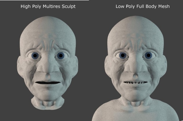
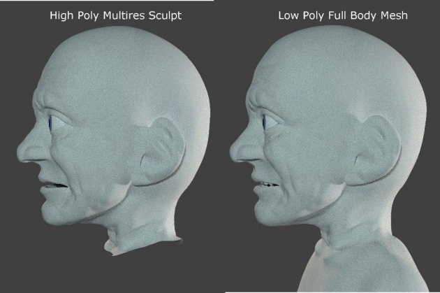
They look very similar, only one of them saves far more memory and is suitable for animation due to the cleaner topology. It doesn't look a 100% like the original, in particular, his silhouette still looks low poly (more visible under the chin), but this is one of the drawbacks of using normal maps. Still, I think I can get away with faking a high poly detailed character using a low poly mesh. Correct me if I'm wrong, but this seems to be a fairly new way of creating detailed characters as I haven't seen this being done in the older days.
Phew, at nearly 45k vertices, I think I'm done with the modeling! I could pat myself for creating a nice looking character, his shape is defined, he seems expressive and his age is showing nicely, but the job is rarely half-done and would take too long to detail in one post. I will probably be splitting this over several parts. In the next post, I'll detail how I went about texturing and shading the old guy!
Subscribe to follow the updates on this project! Also buzz and feel free to drop a comment/feedback or suggestions on the progress so far below!
Check out the film's new website here: uyirthefilm.weebly.com
Thilakanathan Studios Website: http://thilakanathanstudios.weebly.com
BA forum: http://blenderartists.org/forum/showthread.php?343742-Uyir-Short-Film-WIP


