From the last blog post, I described the rigging and clothing process for the main character of "Uyir". In this post, I'll detail the texturing and shading of the old guy.
First, I was looking to give the old man a skin texture. To do this, I did a Google search and looked for front and side references of an old man. Ideally, you want a front and side reference of a person with even lighting and perhaps taken at the same time. You don't want too many highlights (sweat) on the face or dark shadows as this can make your painted model look very strange. Night time photos or sunny photos were no good either. Ensuring your photos have even lighting helps add more realism to the CG face and if only outdoor photos are possible, I'd recommend overcast photos as they tend to have even white lighting and soft shadows. You'd think that finding these photos would be easy, but this process was one of the most time consuming and frustrating tasks I had to deal with. The website 3d.sk has great references with that ideal look but is not possible to obtain unless I pay for the images, so I stuck with Google. Maybe if I go professional one day, I might think about using 3d.sk. Once I found some images, I would then go in and project paint the skin texture over the 3D model. The images I found were less than ideal. Basically, I clone a part of the image texture and paint over the 3D model. Once finished, I would obtain the image below:
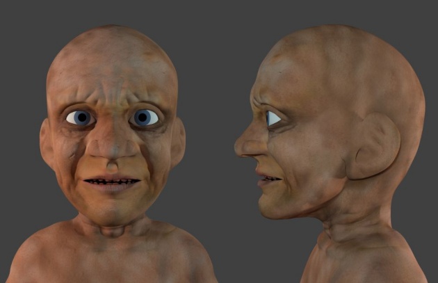
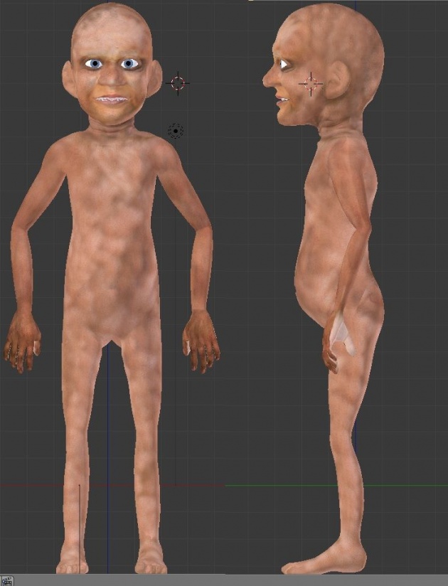
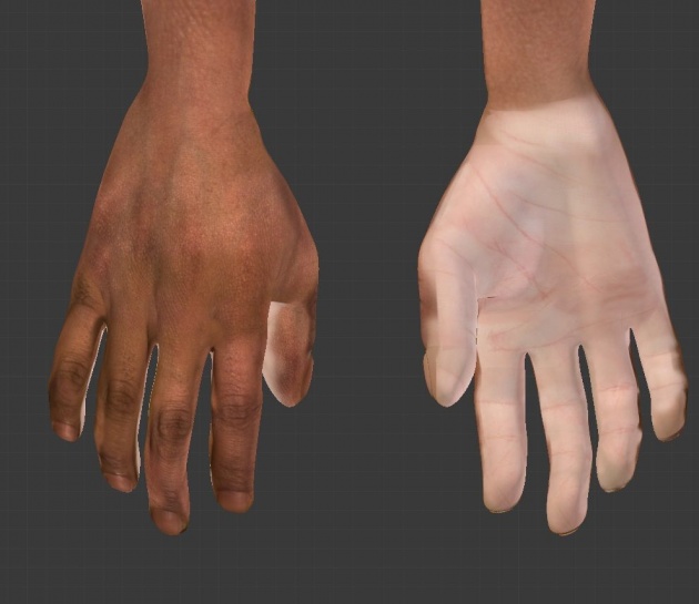
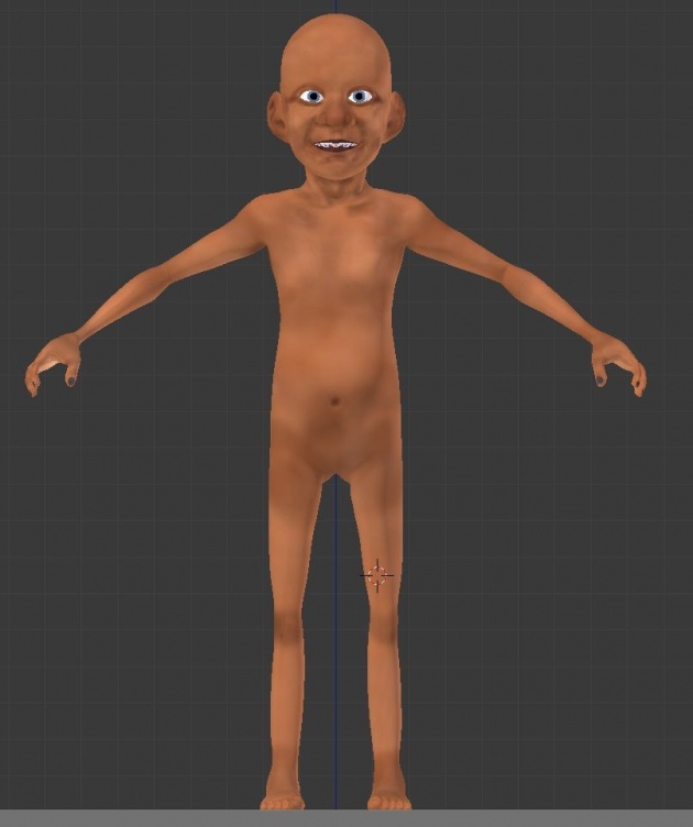
Based on the feedback of fellow Blender artists, the face looked a little bit creepy. Due to the stylistic nature of my film, creating a too realistic skin texture can come off looking a bit creepy. To add a bit of a stylistic look to the texture, I re-painted the character with basic colours. I started with a base colour for his skin and applied to his entire body. I then turned down the brightness of the base colour in the brush settings and lightly painted in areas where there were crevices and joints. Finally, I would turn up the brightness of the base colour in the brush settings and lightly paint in highlights. This gave a very painterly look. Here is the result of the painted model:
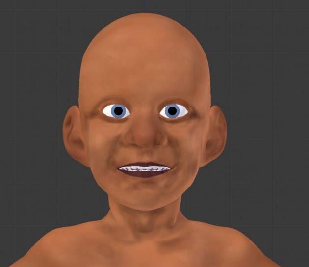
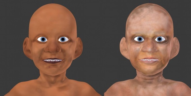
Now the problem was that it looked too simple when rendered, almost amateur-like. The original realistic skin texture would benefit as I could use it for normal mapping to add more realistic skin bumping. This can further enhance the sculpted detail and add fine wrinkles to the model. I ended up using a fusion of the two. I combined and mixed both the realistic skin texture and the simple painted skin texture to a level that I liked. In other words, a bit of realistic skin texture to see some skin detail and a bit of simple skin texture to remove the 'creepy' look of the model.
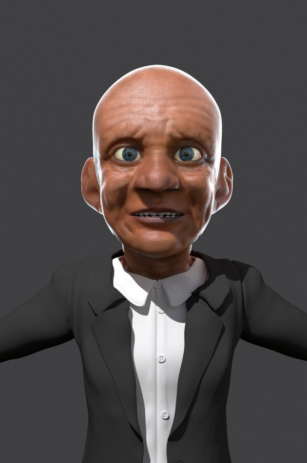
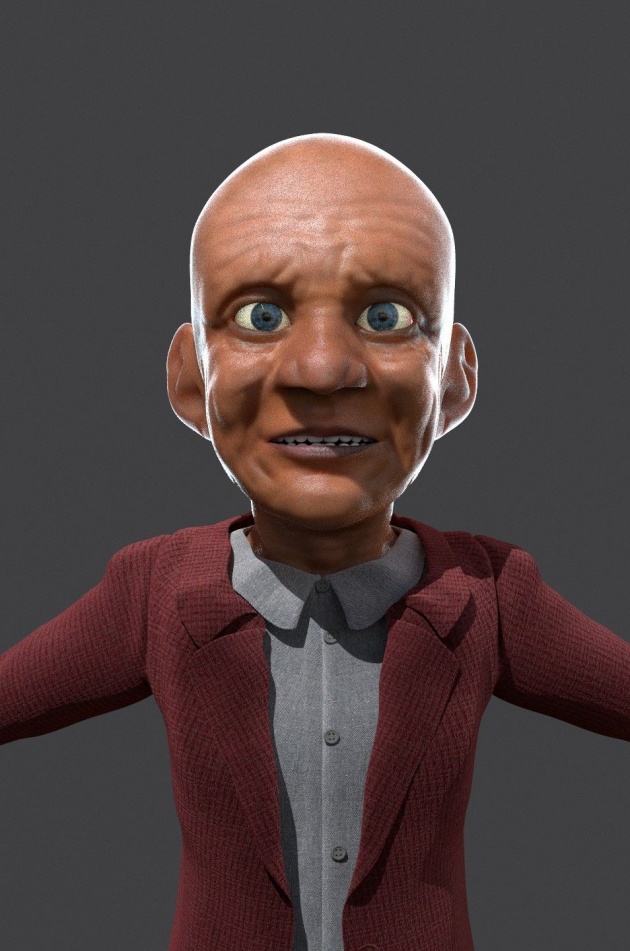
I then moved onto shading the character. This involved using the texture and making it look like skin. The look of skin is very different compared to that of other materials such as rock, ceramic, metals, carpet, etc. To create the skin, I followed Kent Tramell's realistic skin tutorial. I shouldn't post the node setup here as his tutorial is a paid tutorial and is not free. Basically the shader is a combination of subsurface scattering, glossy and bump. The combined texture is input into the subsurface scattering shader. This gives the skin a milky..or a jelly sort of look. The fine details such as wrinkles and pores get washed out as a result. A glossy/specular layer is then applied on top of it to bring the fine details back and helps make the skin more believable. A fresnel effect was applied to further enhance the look of realistic skin. This is all explained in very easy steps in the tutorial series.
For the eyes, I didn't just create a sphere with an eyeball texture and apply a basic diffuse shader. This tends to look dull and a little lifeless. To create the look of that Pixar/Dreamworks styled eyes, I created two spheres for the eyeball with one being slightly larger than the other. The larger sphere surrounds the smaller sphere. The larger sphere had a glass shader applied to it, no other textures. This will help give those nice eye reflections and help give the eye that 'wet' look. The inner sphere had the eyeball texture with a subsurface scatter texture and a hint of glossy applied. A bump map was added for the iris part of the eye just to help emphasise the realism.
Below is the result of the skin (and eye) shader:
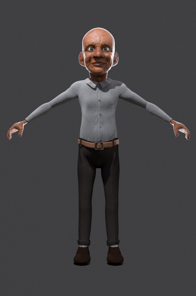
I then went in and textured his clothing. I didn't paint any of the textures. I went to CGTextures.com and downloaded a few fabric textures. These were then applied to the UV-unwrapped clothes and modified the scale as necessary to the correct size of fabric. For the shader, I used a combination of diffuse and velvet shaders to give that cloth look and a fresnel node was again used to emphasise the look of cloth as well as a bump map. Here is the result of the character we have so far:
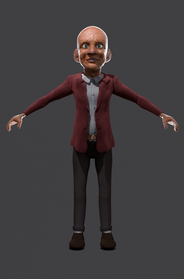
At this point I was happy with what I had and went onto giving him hair and beard. I'll detail this stage in the next post!
Subscribe to follow updates on this project, and if you're not registered on BitLanders, register here!
Website: http://uyirthefilm.weebly.com
BA blog: http://blenderartists.org/forum/showthread.php?343742-Uyir-Short-Film-WIP


