After 3 weeks of on-and-off effort, the sets for the film have now been designed, built and completed. There are about 16 sets for the film overall. There were two main goals of the set design stage: Good Visual Quality and Optimized Render Times. Achieving both these goals was going to be very difficult so I had to ensure that the trade-off between quality and render times was relatively well balanced.
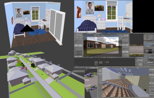
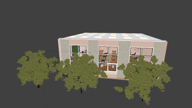
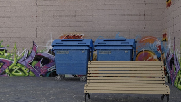
The sets were built starting from primitive objects such as cubes and cylinders. Extrusions and cuts were then made to create windows and doorways. I used the WindowGenerator 2 add-on found within the latest Blender version. The Sapling add-on was used to generate the trees. I would also use modifiers such as the array modifier to create the seats and tables such as the one in the lecture hall. I also obtained all of the textures from CGTextures.com which contains a library of high quality textures which you can use in your own projects.
Visual Quality
One of the main goals of the film (or any film for that matter) is that it must be watchable. Having impressive looking visuals helps make a film more watchable compared to a film that has plain visuals. So I set out to build sets for the film that had a splash of color everywhere. I was going for that kind of feel-good movie look but one that was filled with color and warmth. Having color in the film would also help attract the attention of children watching the film.
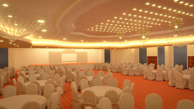
As I was modelling each of the sets, I was made aware by the Blender community that the sets looked too realistic which meant my cartoonish characters risked looking out of place and hence entering the ‘uncanny valley’ yet again. This meant I had to go through and tone down all the realistic shaders. The sets still look more realistic than cartoony however, I think I will be sticking with this kind of look. The film will be a combination of realistic and cartoony. I have seen combinations like this working before, for instance the M&M chocolate ads. Just searching for some of the ads on YouTube, you’ll find that the M&M characters look very cartoony but are placed in actual real life environments, sometimes interacting with real life characters. However, even with this strange combination, we as the audience still believe the characters are real when watching it. Another example is Smurfs but simply searching “Smurfs review” on Google search suggests almost immediately the film wasn’t exactly a hit. I guess this film will not go to that extreme kind of level since everything is still CG, but I just hope I can make it work well.

Source: http://www.mdgadvertising.com/blog/mms-ms-brown-plays-the-dating-game-in-new-tv-commercial/
Render times
Since this is a long film containing many sets and many characters, it was imperative to keep the render times very short in order to release the film in the foreseeable future instead of a time where pretty much everyone has forgotten about it (myself included :) ). So, one of my goals was that MOST of the sets would need to render in about 9-10 minutes per frame. I capitalised the word ‘MOST’ since there may be the occasional 1 or 2 sets that could take much longer if the set was not to be seen that much in the film. The main character’s room would need to be rendered very quickly, since his room will be shown a lot throughout the film but his exam room for instance can take longer since it will probably only be shown for a few seconds.
Having said this, I might end up with crazy long render times yet again like in my earlier film “Tripping” where each frame would take on average 2 hours to render (some reaching even 44 hours per frame!). In this case, I will be using the Blender renderfarms a lot to help me with this.
In the next blog post, I will detail the animatic stage...


