Mike Parker, considered the "godfather" of the Helvetica font, died on Sunday, February 23.
Look at the letters in these words. Really look at them: the shape of the circle that makes the "o" and the roundness of the "c."
Look at how wide and tall they are. Look at the spaces between them.
How do the lowercase letters make you feel? HOW ABOUT THE CAPITALS?
A lot of consideration goes into designing a font, but somehow we're all able generally to accept the typefaces around us, ignoring their subtle design quirks as though they're as ordinary as air. We read their content but don't think too much about their form.
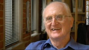
In this way, the Helvetica font has established itself. There's even a movie about it -- the 2007 documentary "Helvetica."
One of the people responsible for the popular use of Helvetica, Mike Parker, died Sunday at age 84.
His son, Harry Parker, considers his father to be the "godfather" of the Helvetica font, as a Fast Company headline described him.
"My dad didn't draw Helvetica, but he was very instrumental in it," Harry Parker said.
BMW, Target, American Apparel and Mattel are all vastly different companies, but they all have one characteristic in common: The Helvetica font in their logos.
Words printed in Helvetica tell you what stop you're at on the New York subway. You might also see it in house numbers and tax forms.
Interviewed in the "Helvetica" film, Mike Parker praises the "firm" quality of the font and the way that the spaces between characters "just hold the letters."
"It is not a letter that's bent to shape; it's a letter that lives in a powerful matrix of surrounding space," he said. "It's -- oh, it's brilliant when it's done well."
Helvetica was born as "Neue Haas Grotesk" in 1957, a collaboration between Max Miedinger with Eduard Hoffmann, for the Haas Type Foundry in Münchenstein, Switzerland. The original, pre-digital font is different from what we know today.
In the post-World War II era, design was seen as part of a movement toward social responsibility, openness and reconstruction, design writer Rick Poyner said in the film. Swiss designers in the 1950s were pushing the idea of "rational typefaces" for information that would "present those visual expressions of the modern world to the public in an intelligible, legible way," Poyner said.
Linotype machines were commonly used in printing at that time. Mike Parker comes into the Helvetica story as the director of typographic development at Mergenthaler Linotype Co.
"He oversaw its development into a font published for the Linotype machines," Harry Parker said.
Under his leadership, more than 1,000 typefaces, including Helvetica, were added to the company's library, which became an industry standard.
Parker made a name for himself by bringing fonts to the world, while his original career path might have unearthed rocks and minerals.
Born in London in 1929, Mike Parker had intended to become a geologist, like his father, Harry Parker said. He then turned to painting but discovered that he was colorblind.
"What does a colorblind painter do? Type is black and white so that was the logical direction to go in," Harry Parker said.
Parker graduated from Yale University with an undergraduate degree in architecture and master's in design. He got a job at the Plantin-Moretus Museum in Antwerp, Belgium, a museum with an extensive historical typography collection, and "that's where Mike fell in love with the whole thing," font designer Matthew Carter said.
After Linotype, Carter and Parker formed a company called Bitstream in 1981, the first company dedicated to producing digital fonts, his ex-wife Sibyl Masquelier said.
Parker also founded a company called Pages Software in 1990, which featured a word processor developed on the NeXTSTEP operating system, developed by Steve Jobs' early company NeXT Computers. Pages was in the beta stage when NeXT was discontinued in 1995, Masquelier said. Apple later named a word-processing program Pages.
Parker additionally served as the historian for the Font Bureau, a typeface design foundry.
He would often bring conversations back to typography, Masquelier said. She remembers him complaining about how fonts he had once overseen were being used on trucks, or how ugly other typefaces looked in magazines.
"He hated the fonts that looked like they had a machine gun shooting them," she said. "Mike was all about classy style."
Famous Helvetica logos:

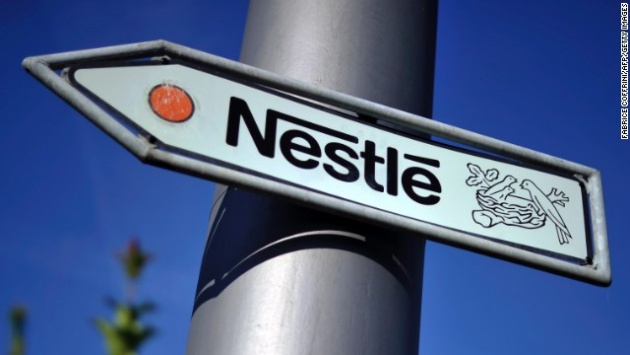
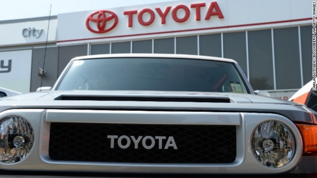



Source: CNN
Annex News - Tech


