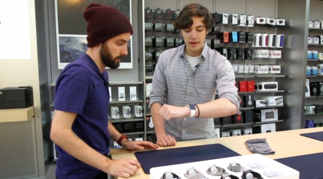
Apple began offering previews of the Apple Watch at its stores this morning, and we had a chance to show up early and get a run-through of the demo process before doors opened to customers looking to make an appointment.
As expected, Apple’s changed up the layout of its Store to accommodate the Watch. In the Palo Alto store, they’ve brought in a long table containing all 38 models available to order under a pane of glass. When it’s time for your appointment, an Apple representative walks you over to a designated fitting table covered with blue leather mats (made from the same material as Apple’s iPhone cases).
Yes, the Apple Store rep will help you try on the watch. No, it isn’t really awkward.
After walking over to a table away from the crowd of reporters, an Apple retail employee went to the back to grab a tray holding (and charging) a variety of models, and after comparing the 38 and 42 mm sizes I decided the latter was more appropriate for my wrist. I got to try out several different types of bands: a fluoroelastomer sport band, the Milanese loop, and the $449 Link Bracelet (though it wasn’t adjusted, so it hung rather loosely on my wrist). For my pre-order, I don’t need anything more than the sport band (which is surprisingly comfy compared to the rubber bands that come with most fitness trackers, if a bit tricky to put on the first time), but eventually I could see myself occasionally accessorizing with one of the more premium bands.
The Sport model is light, so it’ll be comfortable to wear while you work out. With that said, I’m a bit anxious about scratching up my Watch’s face, so I decided to at least give the steel Watch a chance. It’s a bit heavier than the Sport, but the sapphire display should stand up to use by those of us who can’t help but give our gadgets the occasional scuff. If you do go for the Sport model, you can still swap the bands for those sold for the steel Watch, so unless the contrasting metals somehow offend your taste, you shouldn’t worry about not being able to dress that up, too.

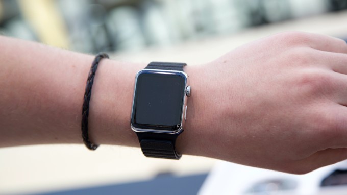
Apple Watch with the leather loop band. You don’t get to try Watch OS on the units they use for fitting demos.
Unfortunately, the models they bring out for fitting are running a video loop, not a Watch OS demo. There are demo units in the store, but those are bolted into displays that stay on the tables — you don’t get a sense of the Taptic vibration for notifications or what it’s like to check the Watch by raising your arm to turn the screen on for six seconds.
Still, you do get to try out most of the Watch’s interface. Instead of showing the apps when you first turn on the display, the watch face is the “home” screen — it’s where you can swipe down to see notifications and swipe up to see the Glances, which show bits of info from your installed apps, your reserve battery, as well as a a Control Center-like widget for toggling Wi-Fi or Do Not Disturb.
To access the actual apps installed on the in-store Watch, you either push in the Digital Crown or tap on a corresponding Glance. Apple didn’t pre-install any third-party apps for its display unit, and instead of pairing the device with an iPhone, the iPad-like display to the side of each demo unit gives a description of what you’re doing, which gives you the freedom to check things out without worrying about getting lost in the interface.
The most intriguing part of the demo experience is messaging. Each demo unit comes loaded with messages and emails to respond to or dismiss, and you have your pick of response types: pre-baked messages for quickly responding to a text, a short audio clip, a transcribed message (which worked very well in the loud-and-crowded store), and fun emojis which animate as you rotate the crown. Each option will be preferable in different contexts, and Apple made them equally easy to use quickly. To initiate a conversation, you don’t even need to go from the watch face to the app screen — you can just tap the button next to the digital crown to go to a screen with shortcuts to your recent contacts.
I also look forward to controlling music and podcasts from my wrist. The default music app ties into your iTunes library and gives you big buttons for pausing and skipping around as well as the option to use the crown to adjust volume. I generally don’t wear headphones with integrated controls, so reaching for my wrist to make quick volume adjustments (or skip the ads in podcasts) seems like it’ll be a huge convenience compared to getting my phone out of my pocket and unlocking it, even with Touch ID.
My biggest concern upon first use is that the touch-targets in the top left corner are a bit tiny, and in some apps the text isn’t actually a button you can press. It’s one of those things that could frustrate a lot of people, but just as the Home button offers an escape hatch on your iPhone, Watch owners can push in the crown at any time to get back to more familiar territory.
If you’re still on the fence about picking up an Apple Watch, I’d recommend scheduling a quick visit to the Apple Store. Photos of the Watch on other people’s wrists simply don’t give an accurate idea of what it’s like to have it on. That goes for software too — the Watch OS offers new modes of interaction that you should try before committing to living with.


