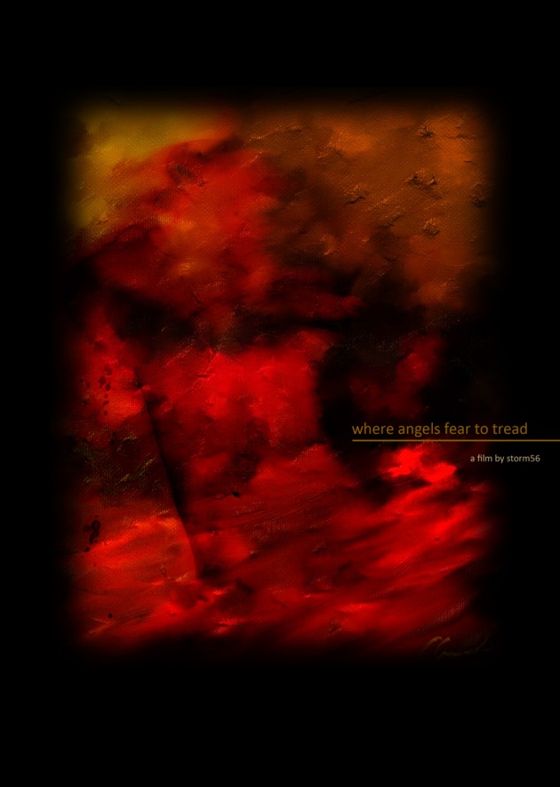
Starting to send scripts out for the film we're producing so I'm just looking at some suitable imagery. This is where I am at the moment though it may be a bit abstract once we get to shooting. The film is rich with abstract imagery giving the audience clues and I thought the colour and anguish in this composition gave the correct tone...as opposed to a couple of stars leaning on things. Not sure I like the font or whether we should use the company name Fuzzy Duck or even if this is the right thing to do when sending out scripts for a pilot scene but I tend to go with my gut instinct...it's got me this far.
Dave


