Both the Apple Watch and Android Wear provide plenty of value for certain wearers thanks to decent implementations of actionable notifications. But after a few weeks with the Apple Watch, it’s apparent that most apps haven’t quite figured out how to be useful on your wrist.
For developers who didn’t have a Watch available before its release (that would be most of them), it was easy to assume that the best route to take was to shrink down their iPhone applications within the constraints of the WatchKit SDK — strip out some extraneous features, hide some stuff in a menu accessible via Force Touch, ship.
Workflow, an app originally built to let you automate frequent tasks on your iPhone or iPad, is one of the few apps available on the Apple Watch that seems built specifically for the smaller form factor.
On the phone Workflow lets users create a recipe of actions (take N number of pictures, piece them together into a GIF, send to X, Y, and Z recipients) and generate a home screen button or iOS action extension to perform that task with one tap at any time.

At $2.99 Workflow is a killer app for iPhone power users. But on the Watch, it’s an example of what apps across the board should look like on smart watches, Apple-made or otherwise.
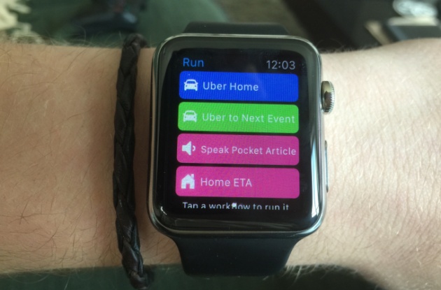
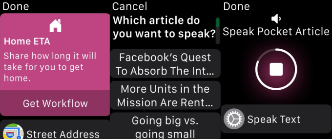
Instead of providing an interface with options to pick from a menu or icons representing actions, Workflow on the Apple Watch has been stripped down to verbs. I want an Uber home, or to the next meeting in my calendar. I’m walking home and want to send an ETA to my roommates. Maybe I’m on BART and it’s just too tightly packed to read on my phone — no worries, I can pick a Pocket article to be read over the headphones plugged into the iPhone in my back pocket.
There are no gestures to remember or content to download to fill a feed. It’s the perfect application for the WatchKit app paradigm, with a single tap executing multiple instructions on the phone. And if, say, a destination or article needs to be picked, the pre-made workflows in the app’s gallery will serve up a few options that users are likely to choose.
Over the coming months, most developers will figure out that the best question to ask themselves when designing smart watch apps is, “What can I help users do with a single tap?” With cameras, LTE, GPS, screen size, and battery life keeping the smartphone relevant for the foreseeable future, developers should assume that users will always have a phone on them for any action that takes longer than raising your wrist, swiping once or twice, and tapping a button or two.
Workflow’s flaws demonstrate how apps will get better as Apple exposes native functions to third-party developers. Some workflows still require completing a step, like choosing the recipient of an automated text message, from the Messages app on the connected phone, which it gives a shortcut to via Handoff. Others have wonky behavior when activated from the Watch because Apple shuts off the Bluetooth radios to conserve power, temporarily pausing the article playing back. These and other tiny sources of frustration will go away as Apple opens up things like resource caching on the Watch (hopefully a few weeks from now at WWDC).


