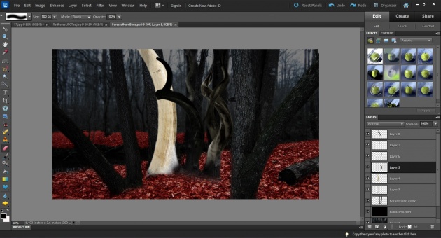
So, I had to start over three times this weekend... I had an image in my head of how I wanted a particular scene to look, but when I sat down at the computer - it wouldn't take shape. Finally, after a full day of trial and error, I came up with a design for the "Forest of Horn and Bone" that fits the PERSEPHONE series even better than my original idea. Does this happen to you too? Sometimes our vision and planning simply make it possible to sit down and actually start the work. And what should be there will come out in the end, if you're willing to let go and allow it to take on its own form.

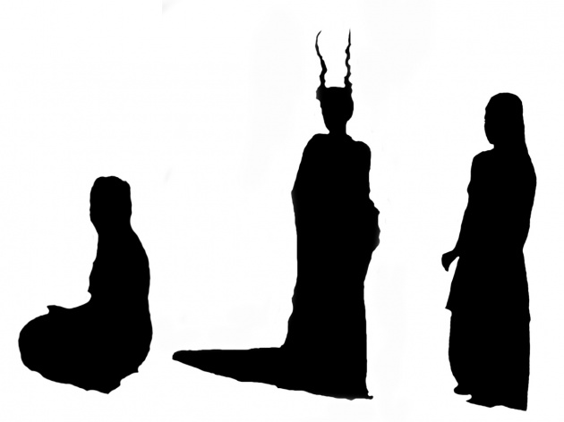
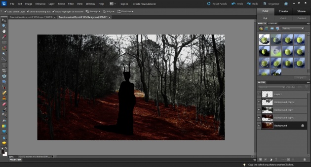
Episode 3 (The Tale of the Deer Queen) is an origin tale, so I wanted it to stand apart from the other episodes. I'm experimenting with this series, which is freeing, also frustrating, and a good lesson in trusting yourself as an artist. I'm using silhouettes briefly in this episode to give it a storybook feel. My film "The Queen of Wonderland" uses this technique as well: http://www.filmannex.com/webtv/inbytheeye/movie/the-queen-of-wonderland/25343
Instead of purchasing stock silhouettes, I made my own using photographs taken of Carrie Anne Hunt on set. That way, they set my actress into the storybook, and the audience still recognizes and relates to her, but in a different setting. Also, I wasn't sure I'd be able to find a stock "horned queen" silhouette for purchase. ;)

Colors are very important to me when world-building for a tale. In my last post, as well as in Episode 2, you see a black&white Underworld interrupted by the red leaves, and red dress of the Deer Queen. Red is a loaded color, particularly in fairy tales. In this series is indicative of many things: death, life, blood, emergence, the extremes of the cycle of life.
In Episode 3, I also use color to differentiate between the real world and the storybook one. When we see live action footage of Persephone, it's the trees that are red, but when we see segments of the silhouette illustrations, it's the ground that is red. I wanted to separate the two worlds on purpose, to draw the audience deeper into the tale, and also give the notion that Persephone herself is aware that she exists inside this story.

I'm not sure all my metaphors are obvious, but they're inserted into the fabric of the film to give viewers a complete world. Every shot to me is an expression, and I hope they will speak to the people who have gathered around to watch this series unfold, and connect with their own personal tales.
Lisa


